Card and gallery layouts need columns that appear when there is enough room and collapse before content becomes cramped. CSS Grid can do that with an auto-repeat track list, so the layout responds to available inline size without a custom breakpoint for every card count.
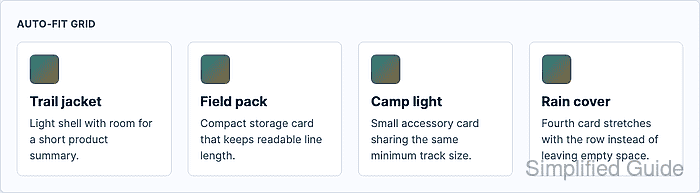
The pattern combines repeat() with auto-fit and minmax(). The browser creates as many tracks as fit the grid container, collapses empty auto-fit tracks after item placement, and lets existing items stretch through 1fr when spare space remains.
Choose the minimum track size from the content, not from a device name. A card minimum such as 14rem keeps short product cards readable, while min(100%, var(–card-min)) prevents overflow when the grid container becomes narrower than the chosen minimum.
Steps to create an auto-fit CSS grid layout:
- Add markup for the grid container and repeatable cards.
<section class="product-grid" aria-label="Featured products">
  <article class="product-card">
    <h2>Trail jacket</h2>
    <p>Light shell with room for a short product summary.</p>
  </article>
  <article class="product-card">
    <h2>Field pack</h2>
    <p>Compact storage card that keeps readable line length.</p>
  </article>
  <article class="product-card">
    <h2>Camp light</h2>
    <p>Small accessory card sharing the same minimum track size.</p>
  </article>
  <article class="product-card">
    <h2>Rain cover</h2>
    <p>Fourth card stretches with the row instead of leaving empty space.</p>
  </article>
</section>
- Choose the minimum card width.
The sample uses 14rem so each card has room for a heading and a short paragraph. Increase the value for denser card content, or decrease it when shorter labels can remain readable in narrower columns.
- Create the auto-fit grid tracks.
.product-grid {
  --card-min: 14rem;
  display: grid;
  grid-template-columns: repeat(auto-fit, minmax(min(100%, var(--card-min)), 1fr));
  gap: clamp(1rem, 2vw, 1.5rem);
}
auto-fit collapses empty repeated tracks after items are placed. Use auto-fill only when empty reserved tracks should still occupy row space.
- Keep each card shrinkable inside the flexible track.
.product-card {
  min-width: 0;
  padding: 1rem;
  border: 1px solid #d7dfec;
  border-radius: 0.5rem;
  background: #fff;
}

.product-card h2,
.product-card p {
  overflow-wrap: break-word;
}
min-width: 0 lets long text shrink inside the grid track instead of forcing the container wider than the viewport.
- Check the grid in a narrow container.
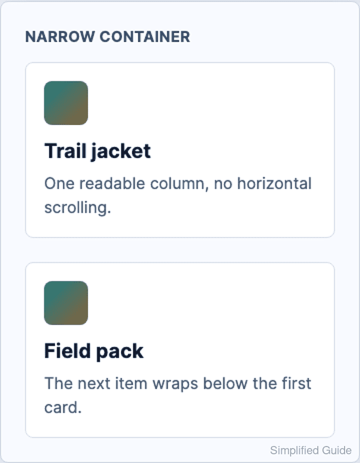
At a 310px grid width, the sample remains one column with no horizontal overflow.
- Check the grid in a wide container.
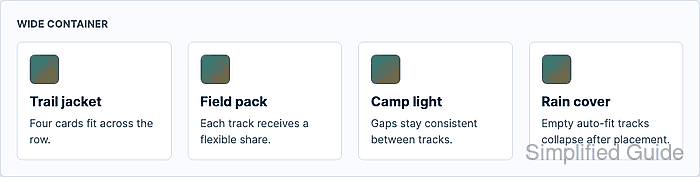
At a 990px grid width, the sample expands to four flexible columns with no horizontal overflow.
- Verify the computed columns and overflow state in the browser DevTools Console.
const grid = document.querySelector(".product-grid");
const columns = getComputedStyle(grid).gridTemplateColumns.split(" ").length;
`${columns} columns / overflow ${document.documentElement.scrollWidth > document.documentElement.clientWidth}`;
"4 columns / overflow false"
Repeat the check after resizing the viewport. The column count should drop as space runs out, and the overflow value should remain false.

Mohd Shakir Zakaria is a cloud architect with deep roots in software development and open-source advocacy. Certified in AWS, Red Hat, VMware, ITIL, and Linux, he specializes in designing and managing robust cloud and on-premises infrastructures.


