Responsive breakpoints let a page change layout when the viewport gives content enough room to use a different arrangement. They are useful when cards, forms, navigation, or long text feel cramped at one width and wasteful at another.
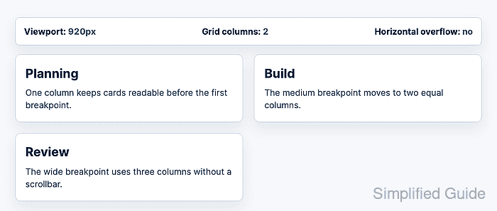
CSS media queries evaluate conditions such as min-width against the browser viewport. A mobile-first base layout followed by wider viewport rules keeps the default CSS readable on small screens and adds columns only when the content can support them.
Using rem units for breakpoint widths lets the switch follow the root text size. With a default 16px root size, 48rem is 768px and 72rem is 1152px, but the browser evaluates the rem values from the active root font size.
Steps to set responsive CSS breakpoints:
- Confirm the page uses the responsive viewport meta tag.
<meta name="viewport" content="width=device-width, initial-scale=1">Without this tag, mobile browsers may lay out the page against a wider virtual viewport, which makes viewport breakpoints behave differently from the visible screen.
- Choose breakpoint widths from the layout content.
The sample grid uses 48rem for two columns and 72rem for three columns. Replace those values with the widths where the real content first has enough room to change layout.
- Set the default layout without a media query.
:root {
  --page-gutter: clamp(1rem, 3vw, 2rem);
}

.product-grid {
  display: grid;
  grid-template-columns: 1fr;
  gap: 1rem;
  margin-inline: auto;
  max-width: 72rem;
  padding-inline: var(--page-gutter);
}

.product-card {
  min-width: 0;
}
min-width: 0 lets grid items shrink inside flexible tracks instead of forcing a horizontal scrollbar when card content is long.
- Add the medium breakpoint for two columns.
@media (min-width: 48rem) {
  .product-grid {
    grid-template-columns: repeat(2, minmax(0, 1fr));
    gap: 1.25rem;
  }
}
The width media feature responds to the viewport in CSS pixels. Avoid device-width for layout breakpoints because hardware device width does not match resized browser windows, split-screen views, or zoomed layouts.
- Add the wide breakpoint for three columns.
@media (min-width: 72rem) {
  .product-grid {
    grid-template-columns: repeat(3, minmax(0, 1fr));
    gap: 1.5rem;
  }
}
- Check the layout just below the first breakpoint.
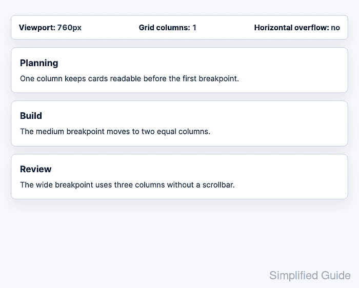
At 760px with the default root font size, the viewport is still below 48rem, so the grid remains one column and the page shows no horizontal overflow.
- Check the layout just above the first breakpoint.
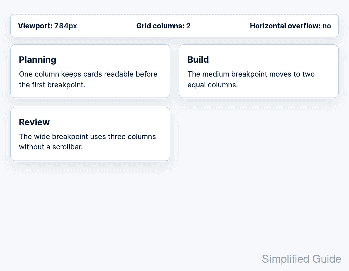
At 784px with the default root font size, the viewport is above 48rem, so the grid switches to two columns.
- Check the layout above the wide breakpoint.
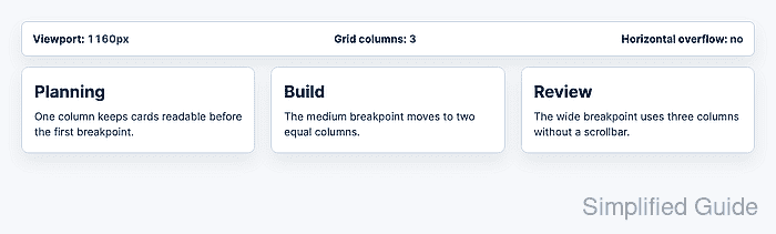
At 1160px with the default root font size, the viewport is above 72rem, so the grid switches to three columns with no horizontal overflow.

Mohd Shakir Zakaria is a cloud architect with deep roots in software development and open-source advocacy. Certified in AWS, Red Hat, VMware, ITIL, and Linux, he specializes in designing and managing robust cloud and on-premises infrastructures.


