Responsive media needs space before the browser knows every intrinsic size. The CSS aspect-ratio property gives an image, video, embed, or wrapper a preferred width-to-height relationship, so a fluid layout can reserve height instead of jumping when content finishes loading.
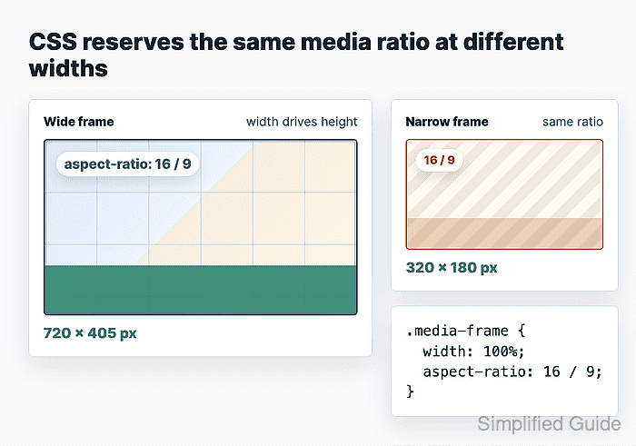
The property works when at least one dimension is automatic. A fixed width can resolve a height from 16 / 9, and a fixed height can resolve a width from the same ratio. If both width and height are fixed, those sizes win and the ratio no longer changes the box.
For media that must crop to one designed shape, put aspect-ratio on a wrapper and let the child fill it with object-fit: cover. For images that should keep their natural crop after loading, use auto 16 / 9 on the image itself as a temporary reservation instead of forcing the final ratio.
Related: How to fix CSS layout shift
Related: How to create an auto-fit CSS grid layout
Steps to set CSS aspect ratio for responsive media:
- Choose the intended visible ratio.
Use 16 / 9 for widescreen video, 4 / 3 for older media, and 1 / 1 for square thumbnails. CSS ratios are written as width over height.
- Add a wrapper around the responsive media.
<figure class="media-frame">
  <img src="/images/product-photo.jpg" alt="Product photo">
</figure>
- Set the wrapper width and aspect ratio.
.media-frame {
  width: min(100%, 48rem);
  aspect-ratio: 16 / 9;
  overflow: hidden;
  margin: 0;
}
aspect-ratio resolves the missing dimension. Remove fixed height values if the ratio appears ignored.
- Make the child media fill the reserved box.
.media-frame > img,
.media-frame > video,
.media-frame > iframe {
  width: 100%;
  height: 100%;
  display: block;
  border: 0;
}

.media-frame > img,
.media-frame > video {
  object-fit: cover;
}
Use object-fit: contain instead of cover when the full image or video must remain visible without cropping.
- Reserve a temporary ratio on a direct image only when its natural crop should win after load.
.article-photo {
  width: 100%;
  height: auto;
  aspect-ratio: auto 16 / 9;
  display: block;
}
The auto keyword lets a replaced element, such as an image, use its natural aspect ratio after the file loads. Omit auto when the designed ratio must stay forced.
- Check the computed frame size in the browser DevTools Console.
const box = document.querySelector(".media-frame").getBoundingClientRect(); `${Math.round(box.width)} x ${Math.round(box.height)} (${(box.width / box.height).toFixed(4)})`; "720 x 405 (1.7778)" - Resize the viewport and repeat the dimension check.
const box = document.querySelector(".media-frame").getBoundingClientRect();
`${Math.round(box.width)} x ${Math.round(box.height)} (${(box.width / box.height).toFixed(4)})`;
"432 x 243 (1.7778)"
A 16 / 9 frame should stay close to 1.7778 at each tested width. A different value usually means another rule is setting height, min-height, padding, or child media sizing.

Mohd Shakir Zakaria is a cloud architect with deep roots in software development and open-source advocacy. Certified in AWS, Red Hat, VMware, ITIL, and Linux, he specializes in designing and managing robust cloud and on-premises infrastructures.


