Reusable components often sit in grids, sidebars, modals, and article bodies where the viewport width says little about the space each instance receives. CSS container queries let a component switch its internal layout from the size of an ancestor container, so the same card can stack in a narrow rail and use columns in a wider slot.
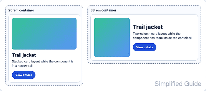
A size query container is created with container-type. The inline-size value is the common choice for width-driven components because it queries the container's inline axis without requiring block-size containment.
The container-name property is optional, but a name keeps the @container rule attached to the intended component when nested layouts have several query containers. Container queries style descendants of the query container, so put the query container on a wrapper or component root and adapt inner elements such as the body, media, actions, or metadata.
Related: How to set responsive CSS breakpoints
Related: How to create an auto-fit CSS grid layout
Related: How to scope CSS rules to a component
Steps to adapt a CSS component with container queries:
- Choose the component wrapper and the width where its internal layout should change.
Use a 34rem threshold when the card has enough room for a 12rem media track and readable text. Pick the threshold from the component content, not from a device name, so the rule still works inside sidebars, cards, modals, and split panes.
- Add markup with an outer component root and inner elements that can change layout.
<article class="product-card">
  <div class="product-card__body">
    <img class="product-card__media" src="/images/trail-jacket.jpg" alt="Trail jacket">
    <div class="product-card__content">
      <h2>Trail jacket</h2>
      <p>Water-resistant shell with a packable hood.</p>
      <a class="product-card__link" href="/products/trail-jacket">View details</a>
    </div>
  </div>
</article>
- Turn the component root into a named inline-size query container.
.product-card {
  container-type: inline-size;
  container-name: product-card;
  overflow: hidden;
  border: 1px solid #ccd5e5;
  border-radius: 0.875rem;
  background: #fff;
}
Use the shorthand container: product-card / inline-size; only when the team is already comfortable reading the name/type order.
- Write the default narrow layout before any container query.
.product-card__body {
  display: grid;
  gap: 1rem;
  padding: 1rem;
}

.product-card__media {
  inline-size: 100%;
  aspect-ratio: 4 / 3;
  object-fit: cover;
  border-radius: 0.75rem;
}
- Add the container query for wider component instances.
@container product-card (min-width: 34rem) {
  .product-card__body {
    grid-template-columns: 12rem minmax(0, 1fr);
    align-items: center;
  }

  .product-card__media {
    aspect-ratio: 1 / 1;
  }
}
The selector inside @container matches descendants of the query container. To change the outer card itself, put an extra wrapper around it and make that wrapper the query container.
- Place one instance below and one instance above the threshold while the viewport stays the same.
<div class="card-demo card-demo--compact">
  <article class="product-card">
    <div class="product-card__body">
      <img class="product-card__media" src="/images/trail-jacket.jpg" alt="Trail jacket">
      <div class="product-card__content">
        <h2>Trail jacket</h2>
        <p>Water-resistant shell with a packable hood.</p>
        <a class="product-card__link" href="/products/trail-jacket">View details</a>
      </div>
    </div>
  </article>
</div>

<div class="card-demo card-demo--wide">
  <article class="product-card">
    <div class="product-card__body">
      <img class="product-card__media" src="/images/trail-jacket.jpg" alt="Trail jacket">
      <div class="product-card__content">
        <h2>Trail jacket</h2>
        <p>Water-resistant shell with a packable hood.</p>
        <a class="product-card__link" href="/products/trail-jacket">View details</a>
      </div>
    </div>
  </article>
</div>
- Set the demo container widths around the query threshold.
.card-demo--compact {
  inline-size: 26rem;
}

.card-demo--wide {
  inline-size: 38rem;
}
- Check the component in the compact container.
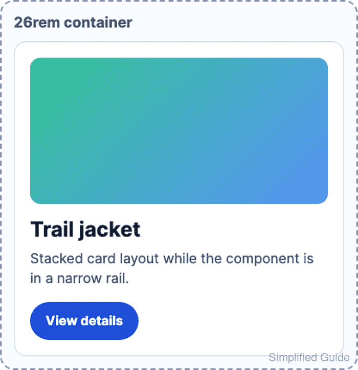
The 26rem container is below the 34rem query threshold, so the card body remains one grid column.
- Check the component in the wider container.
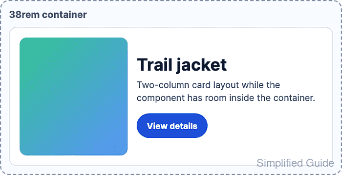
The 38rem container is above the 34rem query threshold, so the card body changes to a two-column grid even though the viewport did not change.
- Verify the applied layout in the browser DevTools Console.
const compactColumns = getComputedStyle(
  document.querySelector(".card-demo--compact .product-card__body")
).gridTemplateColumns.split(" ").length;

const wideColumns = getComputedStyle(
  document.querySelector(".card-demo--wide .product-card__body")
).gridTemplateColumns.split(" ").length;

`${compactColumns} column / ${wideColumns} columns`;
"1 column / 2 columns"

Mohd Shakir Zakaria is a cloud architect with deep roots in software development and open-source advocacy. Certified in AWS, Red Hat, VMware, ITIL, and Linux, he specializes in designing and managing robust cloud and on-premises infrastructures.


