Component styles often share class names and descendant elements with the rest of a page. The CSS @scope at-rule creates a boundary around one component so short selectors such as .card-title and .card-action can style that component without reaching matching elements elsewhere.
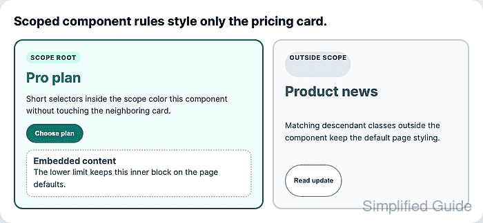
A standalone @scope block starts with a scope root selector and can include a lower scope limit. Selectors inside the block match elements inside that subtree, and :scope targets the root element itself. The scope prelude does not add its selector weight to nested selectors, so a scoped .card-title rule can stay easier to override than a long ancestor selector.
Use scoped rules as a component boundary, not as Shadow DOM isolation. Inheritance, cascade layers, importance, specificity, and source order still matter, and older browsers that do not support @scope ignore the block. Keep essential page defaults outside the scoped block, then put component-specific changes inside the scope.
Related: How to set CSS cascade layer order
Related: How to debug CSS specificity
Related: How to nest CSS selectors
Steps to scope CSS rules to a component:
- Add a stable class to the component root and keep matching descendants outside the component for comparison.
<article class="pricing-card">
  <span class="card-kicker">Scope root</span>
  <h2 class="card-title">Pro plan</h2>
  <p class="card-copy">Short selectors style only this component.</p>
  <button class="card-action" type="button">Choose plan</button>
</article>

<aside class="news-card">
  <span class="card-kicker">Outside scope</span>
  <h2 class="card-title">Product news</h2>
  <p class="card-copy">Matching classes keep the page defaults.</p>
  <button class="card-action" type="button">Read update</button>
</aside>
The root class should identify the component boundary, not one visual state. Use state classes or attributes inside the scoped block when a component has variants.
- Keep shared page defaults outside the scoped block.
.card-title {
  color: #475569;
}

.card-action {
  border: 2px solid #94a3b8;
  background: #ffffff;
  color: #334155;
}
These declarations still serve browsers without @scope support and keep unrelated cards usable before component-specific rules load.
- Add a standalone @scope block for the component root.
@scope (.pricing-card) {
  .card-title {
    color: #0f766e;
  }

  .card-action {
    border-color: #0f766e;
    background: #0f766e;
    color: #ffffff;
  }
}
The nested .card-title selector keeps the specificity of .card-title. The .pricing-card selector defines the matching boundary instead of adding another class to the selector weight.
- Style the root element with :scope when the component container needs its own rule.
@scope (.pricing-card) {
  :scope {
    border-color: #0f766e;
    background: #f0fdfa;
  }

  .card-title {
    color: #0f766e;
  }
}
:scope matches the current scope root. Use it for the boundary element itself instead of repeating the root class inside the block.
- Add a lower scope limit when nested content should keep page styles.
<article class="pricing-card">
  <h2 class="card-title">Pro plan</h2>

  <div class="pricing-card__embed">
    <h3 class="card-title">Embedded content</h3>
  </div>
</article>
@scope (.pricing-card) to (.pricing-card__embed) {
  .card-title {
    color: #0f766e;
  }
}
The lower limit is exclusive. Descendants of .pricing-card__embed stay outside the scope even though the embedded block is inside the component root.
- Verify that the browser parsed the scoped rule.
> document.styleSheets[0].cssRules[1].constructor.name
"CSSScopeRule"
> document.styleSheets[0].cssRules[1].start
".pricing-card"
> document.styleSheets[0].cssRules[1].end
".pricing-card__embed"
CSSScopeRule confirms the scoped block is present through the CSS object model in the tested browser. Keep the default rules outside the block for browsers that ignore unsupported at-rules.
- Verify that the component title uses the scoped color.
> getComputedStyle(document.querySelector(".pricing-card > .card-title")).color "rgb(15, 118, 110)" - Verify that matching titles outside the root and below the lower limit keep the default color.
> getComputedStyle(document.querySelector(".news-card .card-title")).color "rgb(71, 85, 105)" > getComputedStyle(document.querySelector(".pricing-card__embed .card-title")).color "rgb(71, 85, 105)" - Verify that the component action uses the scoped button style while the outside action keeps the shared default.
> getComputedStyle(document.querySelector(".pricing-card > .card-action")).backgroundColor
"rgb(15, 118, 110)"
> getComputedStyle(document.querySelector(".news-card .card-action")).backgroundColor
"rgb(255, 255, 255)"

Mohd Shakir Zakaria is a cloud architect with deep roots in software development and open-source advocacy. Certified in AWS, Red Hat, VMware, ITIL, and Linux, he specializes in designing and managing robust cloud and on-premises infrastructures.


