How to add a legend in Matplotlib
Multiple data series can share the same axes while differing only by color, marker, or line style. Without an in-figure key, those distinctions depend on surrounding prose and become easy to misread when the chart is copied or exported.
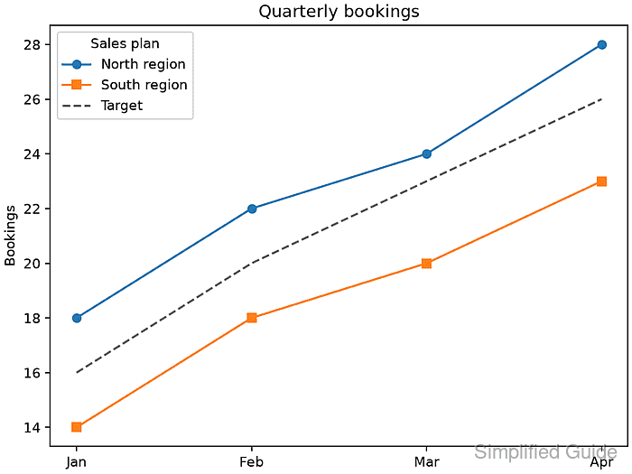
Matplotlib's Axes.legend() can build its entries automatically from plotted artists whose label values do not begin with an underscore. Setting each label when its line is created keeps the legend text attached to the correct series instead of relying on a separate ordered label list.
Use a fixed corner that stays clear of the data, and give the legend a short title when its entries belong to one group. The saved PNG should show North region, South region, and Target with the same line and marker styles used in the plot.
Steps to add a legend in Matplotlib:
- Define the series data and a constrained Axes object in legend_demo.py.
- legend_demo.py
import matplotlib.pyplot as plt

months = ["Jan", "Feb", "Mar", "Apr"]
north = [18, 22, 24, 28]
south = [14, 18, 20, 23]
target = [16, 20, 23, 26]

fig, ax = plt.subplots(layout="constrained")
- Plot the three labeled lines after the Axes definition in legend_demo.py.
ax.plot(months, north, marker="o", label="North region")
ax.plot(months, south, marker="s", label="South region")
ax.plot(months, target, linestyle="--", color="0.35", label="Target")
Axes.legend() ignores artists whose labels are empty or begin with an underscore, which keeps helper lines out of the automatic legend.
- Complete the final legend-rendering section in legend_demo.py.
legend = ax.legend(loc="upper left", title="Sales plan")
ax.set_title("Quarterly bookings")
ax.set_ylabel("Bookings")

fig.savefig("legend-add-output.png", dpi=160)

labels = [text.get_text() for text in legend.get_texts()]
expected = ["North region", "South region", "Target"]
if labels != expected:
    raise RuntimeError(f"Unexpected legend labels: {labels}")

print(f"Legend labels: {', '.join(labels)}")
print("Saved figure: legend-add-output.png")
A fixed loc value keeps placement repeatable; lower right suits plots whose upper-left area contains data.
- Run legend_demo.py from the directory that should receive the image.
$ python3 legend_demo.py
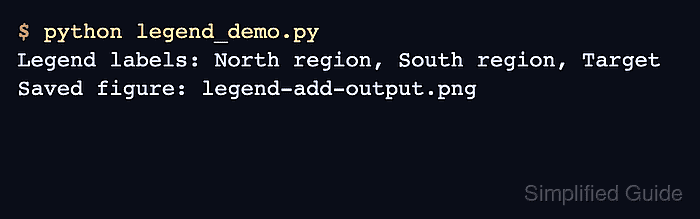
Legend labels: North region, South region, Target
Saved figure: legend-add-output.png
- Confirm legend-add-output.png shows one matching legend entry for each plotted series.