How to create an auto-fit CSS grid layout
Card and gallery layouts need columns that appear when there is enough room and collapse before content becomes cramped. CSS Grid can do that with an auto-repeat track list, so the layout responds to available inline size without a custom breakpoint for every card count.
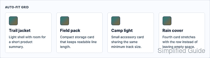
The pattern combines repeat() with auto-fit and minmax(). The browser creates as many tracks as fit the grid container, collapses empty auto-fit tracks after item placement, and lets existing items stretch through 1fr when spare space remains.
Choose the minimum track size from the content, not from a device name. A card minimum such as 14rem keeps short product cards readable, while min(100%, var(–card-min)) prevents overflow when the grid container becomes narrower than the chosen minimum.
Steps to create an auto-fit CSS grid layout:
- Add markup for the grid container and repeatable cards.
<section class="product-grid" aria-label="Featured products">
  <article class="product-card">
    <h2>Trail jacket</h2>
    <p>Light shell with room for a short product summary.</p>
  </article>
  <article class="product-card">
    <h2>Field pack</h2>
    <p>Compact storage card that keeps readable line length.</p>
  </article>
  <article class="product-card">
    <h2>Camp light</h2>
    <p>Small accessory card sharing the same minimum track size.</p>
  </article>
  <article class="product-card">
    <h2>Rain cover</h2>
    <p>Fourth card stretches with the row instead of leaving empty space.</p>
  </article>
</section>
- Choose the minimum card width.
The sample uses 14rem so each card has room for a heading and a short paragraph. Increase the value for denser card content, or decrease it when shorter labels can remain readable in narrower columns.
- Create the auto-fit grid tracks.
.product-grid {
  --card-min: 14rem;
  display: grid;
  grid-template-columns: repeat(auto-fit, minmax(min(100%, var(--card-min)), 1fr));
  gap: clamp(1rem, 2vw, 1.5rem);
}
auto-fit collapses empty repeated tracks after items are placed. Use auto-fill only when empty reserved tracks should still occupy row space.
- Keep each card shrinkable inside the flexible track.
.product-card {
  min-width: 0;
  padding: 1rem;
  border: 1px solid #d7dfec;
  border-radius: 0.5rem;
  background: #fff;
}

.product-card h2,
.product-card p {
  overflow-wrap: break-word;
}
min-width: 0 lets long text shrink inside the grid track instead of forcing the container wider than the viewport.
- Check the grid in a narrow container.
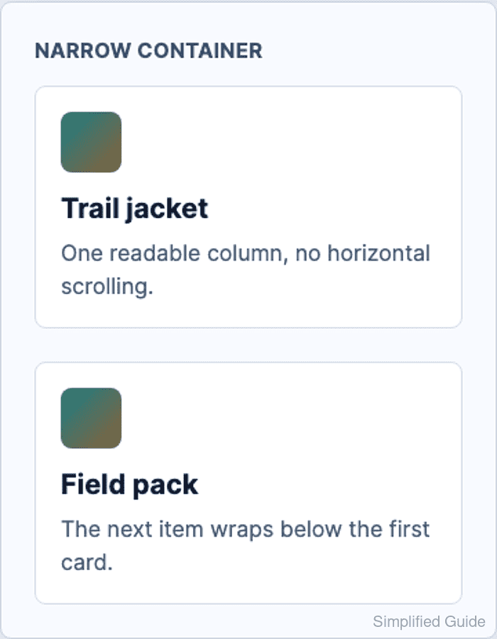
At a 310px grid width, the sample remains one column with no horizontal overflow.
- Check the grid in a wide container.
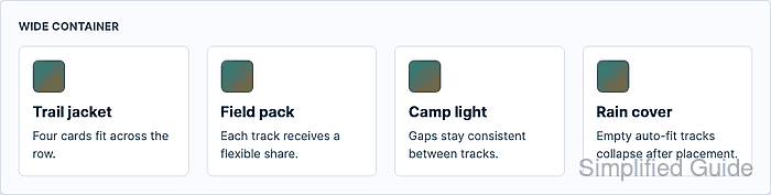
At a 990px grid width, the sample expands to four flexible columns with no horizontal overflow.
- Verify the computed columns and overflow state in the browser DevTools Console.
const grid = document.querySelector(".product-grid");
const columns = getComputedStyle(grid).gridTemplateColumns.split(" ").length;
`${columns} columns / overflow ${document.documentElement.scrollWidth > document.documentElement.clientWidth}`;
"4 columns / overflow false"
Repeat the check after resizing the viewport. The column count should drop as space runs out, and the overflow value should remain false.