How to style an HTML form with CSS
HTML forms collect typed input, validation feedback, and submit actions in a compact part of the page. Styling the native controls with CSS keeps labels, keyboard focus, required fields, and mobile input behavior attached to the elements the browser already understands.
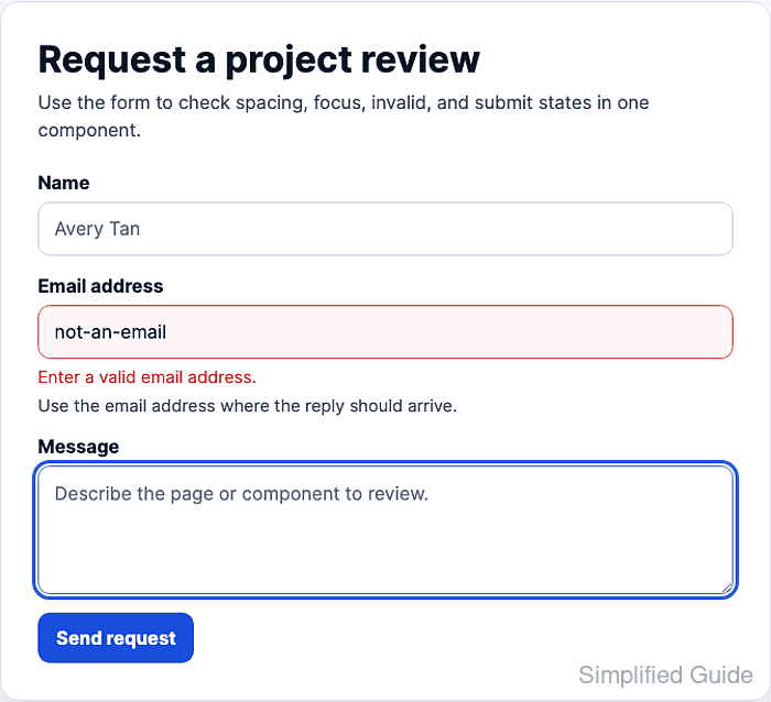
A semantic form starts with labels, input types, required attributes, helper text, and error text before the visual layer is added. CSS can then control spacing, borders, focus rings, invalid states, and the submit button without replacing form behavior with custom containers.
A single-column layout keeps labels and controls readable at narrow widths. When a field becomes :user-invalid, the red border and error text identify the problem without making untouched required fields look broken, while the browser still owns the actual validity state.
Steps to style an HTML form with CSS:
- Add semantic form markup with labels, native field types, helper text, and error text.
- index.html
<form class="contact-form" action="/contact" method="post">
  <div class="form-row">
    <label for="name">Name</label>
    <input class="form-control" id="name" name="name" type="text" autocomplete="name" required placeholder="Avery Tan">
    <p class="form-error">Enter your name.</p>
  </div>

  <div class="form-row">
    <label for="email">Email address</label>
    <input class="form-control" id="email" name="email" type="email" autocomplete="email" required placeholder="avery@example.com" aria-describedby="email-error email-hint">
    <p class="form-error" id="email-error">Enter a valid email address.</p>
    <p class="form-hint" id="email-hint">Use the email address where the reply should arrive.</p>
  </div>

  <div class="form-row">
    <label for="message">Message</label>
    <textarea class="form-control" id="message" name="message" required placeholder="Describe the page or component to review."></textarea>
    <p class="form-error">Enter a short message.</p>
  </div>

  <button class="form-submit" type="submit">Send request</button>
</form>
Keep validation rules in the markup with attributes such as required and type="email". CSS can style the states, but it should not be the only place where the form's meaning lives.
- Define form color tokens and the responsive form wrapper.
- styles.css
:root {
  color-scheme: light;
  --page-bg: #f8fafc;
  --form-surface: #ffffff;
  --form-text: #0f172a;
  --form-muted: #475569;
  --form-border: #cbd5e1;
  --form-focus: #2563eb;
  --form-error: #dc2626;
  --form-error-bg: #fef2f2;
  --form-button: #1d4ed8;
  --form-button-hover: #1e40af;
  --form-button-text: #ffffff;
}

* {
  box-sizing: border-box;
}

.contact-form {
  display: grid;
  gap: 1rem;
  width: min(100%, 42rem);
}
box-sizing: border-box keeps padding and borders inside the field width, which helps prevent form controls from overflowing on small screens.
- Style each label and form control.
- styles.css
.form-row {
  display: grid;
  gap: 0.45rem;
}

.form-row label {
  color: var(--form-text);
  font-weight: 700;
}

.form-control {
  width: 100%;
  min-height: 2.75rem;
  border: 1px solid var(--form-border);
  border-radius: 0.65rem;
  padding: 0.7rem 0.85rem;
  color: var(--form-text);
  background: var(--form-surface);
  font: inherit;
  line-height: 1.4;
  transition: border-color 160ms ease, box-shadow 160ms ease, background-color 160ms ease;
}

textarea.form-control {
  min-height: 7rem;
  resize: vertical;
}

.form-control::placeholder {
  color: var(--form-muted);
  opacity: 0.85;
}
font: inherit keeps form controls aligned with surrounding page text instead of falling back to browser-specific input fonts.
- Add a keyboard-visible focus state.
- styles.css
.form-control:focus-visible {
  border-color: var(--form-focus);
  outline: 3px solid var(--form-focus);
  outline-offset: 2px;
  box-shadow: 0 0 0 4px rgb(37 99 235 / 0.14);
}
Do not remove browser outlines with outline: none unless a replacement focus style is present and visible against the final page background.
Related: How to style keyboard focus with CSS
- Add post-interaction invalid field styles.
- styles.css
.form-error {
  display: none;
  margin: 0;
  color: var(--form-error);
  font-size: 0.92rem;
}

.form-hint {
  margin: 0;
  color: var(--form-muted);
  font-size: 0.92rem;
}

@supports selector(input:user-invalid) {
  .form-control:user-invalid {
    border-color: var(--form-error);
    background: var(--form-error-bg);
  }

  .form-control:user-invalid + .form-error {
    display: block;
  }
}
:user-invalid waits until the user interacts with the field or tries to submit the form. Use JavaScript or server-rendered error classes as a fallback when older browsers need the same delayed validation display.
- Style the submit button as the form action.
- styles.css
.form-submit {
  justify-self: start;
  min-height: 2.75rem;
  border: 0;
  border-radius: 0.65rem;
  padding: 0.75rem 1rem;
  color: var(--form-button-text);
  background: var(--form-button);
  font: inherit;
  font-weight: 700;
  cursor: pointer;
  transition: background-color 160ms ease, transform 120ms ease;
}

@media (hover: hover) {
  .form-submit:hover {
    background: var(--form-button-hover);
  }
}

.form-submit:active {
  transform: translateY(1px);
}

.form-submit:focus-visible {
  outline: 3px solid var(--form-focus);
  outline-offset: 3px;
}
Use type="submit" for the button that sends the form. Use type="button" only for scripted controls that should not submit.
Related: How to style an HTML button with CSS - Add forced-colors and reduced-motion branches.
- styles.css
@media (forced-colors: active) {
  .form-control,
  .form-submit {
    border-color: CanvasText;
    box-shadow: none;
  }

  .form-control:focus-visible,
  .form-submit:focus-visible {
    outline-color: Highlight;
  }

  .form-control:user-invalid {
    border-color: Highlight;
  }
}

@media (prefers-reduced-motion: reduce) {
  .form-control,
  .form-submit {
    transition: none;
  }
}
- Verify the rendered form states in a browser.
CSS selector support: :focus-visible=true, :user-invalid=true
Keyboard target: message
Keyboard :focus-visible match: true
Keyboard outline: 3px solid rgb(37, 99, 235)
Invalid email :user-invalid match: true
Invalid email border: rgb(217, 69, 71)
Error message display: block
Submit button type: submit
Submit button contrast: 6.7:1
Form text contrast: 17.85:1
Mobile horizontal overflow: false
Mobile form width: 296px inside 360px viewport
These values come from the rendered fixture for the CSS above. Recheck contrast and overflow after changing the page background, form width, button colors, or error color.