Buttons sit at the point where page styling becomes user action, so the visual treatment has to support both pointer and keyboard use. A real HTML <button> element already carries activation, focus, and disabled behavior; CSS should make those states visible instead of replacing them with a generic clickable block.
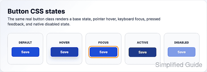
A reusable class keeps the button treatment separate from every button element in the project. That lets form submit buttons, icon buttons, destructive actions, and secondary actions opt in to their own variants without forcing one rule onto all controls.
The sample uses one primary color set, a visible keyboard focus outline, pointer-only hover feedback, pressed-state movement, and a native disabled state. Replace the color tokens with project colors only after checking text contrast and focus contrast against the final page background.
Related: How to style keyboard focus with CSS
Related: How to add a CSS transition
Related: How to style an HTML form with CSS
Steps to style an HTML button with CSS:
- Add a real button element with an explicit type and reusable class.
<button class="button" type="button">Save changes</button>
<button class="button" type="button" disabled>Save changes</button>
Use type="button" for scripted actions that should not submit a form. Use type="submit" only when the control is the form submit action.
- Define the base button style.
.button {
  --button-bg: #1d4ed8;
  --button-bg-hover: #1e40af;
  --button-bg-active: #1e3a8a;
  --button-text: #ffffff;
  --button-focus: #f59e0b;

  display: inline-flex;
  align-items: center;
  justify-content: center;
  gap: 0.5rem;
  min-height: 2.75rem;
  padding: 0.75rem 1rem;
  border: 0;
  border-radius: 0.5rem;
  font: inherit;
  font-weight: 700;
  line-height: 1;
  color: var(--button-text);
  background: var(--button-bg);
  box-shadow: 0 1px 2px rgb(15 23 42 / 0.18);
  cursor: pointer;
  transition: background-color 160ms ease, transform 120ms ease, box-shadow 160ms ease;
}
font: inherit keeps the button aligned with surrounding UI text instead of falling back to browser default button fonts.
- Add hover and pressed states.
@media (hover: hover) {
  .button:hover:not(:disabled) {
    background: var(--button-bg-hover);
    box-shadow: 0 8px 18px rgb(30 64 175 / 0.25);
  }
}

.button:active:not(:disabled) {
  background: var(--button-bg-active);
  transform: translateY(1px);
  box-shadow: none;
}
The hover rule is limited to devices that report pointer hover support, so touch browsers do not need to fake a hover state.
- Add a keyboard-visible focus indicator.
.button:focus-visible {
  outline: 3px solid var(--button-focus);
  outline-offset: 3px;
}
Do not remove all outlines with outline: none unless a replacement focus style is present and visible against the surrounding background.
Related: How to style keyboard focus with CSS
- Style the native disabled state.
.button:disabled {
  opacity: 0.55;
  cursor: not-allowed;
  box-shadow: none;
  transform: none;
}
The disabled attribute prevents normal activation and focus. A disabled-looking class alone only changes appearance.
- Disable button motion for reduced-motion users.
@media (prefers-reduced-motion: reduce) {
  .button {
    transition: none;
  }
}
- Verify the rendered button states in a browser.
Default text contrast: 6.7:1
Hover text contrast: 8.72:1
Active text contrast: 10.36:1
Keyboard focus outline: 3px solid rgb(245, 158, 11)
Disabled property: true
The contrast values match the sample color tokens. Recheck contrast whenever project colors or page backgrounds change.

Mohd Shakir Zakaria is a cloud architect with deep roots in software development and open-source advocacy. Certified in AWS, Red Hat, VMware, ITIL, and Linux, he specializes in designing and managing robust cloud and on-premises infrastructures.


