Forced colors mode lets a browser replace authored colors with a small user-selected palette, most often for high-contrast accessibility settings. Supporting it with CSS keeps content, controls, focus rings, and selected states visible when decorative color choices are no longer in charge.
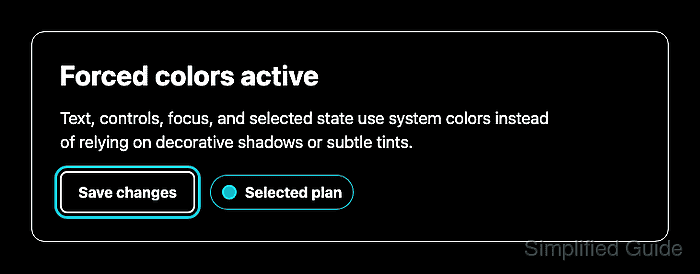
The safest forced-colors branch is small. Let the browser force ordinary text and form-control colors, and use system color keywords such as Canvas, CanvasText, ButtonFace, ButtonText, Highlight, and HighlightText where custom CSS draws borders, indicators, or interaction states.
Focus indicators and selected states need visible outlines, borders, or markers because shadows and subtle background tints can disappear under forced colors. Avoid forced-color-adjust: none except for rare brand or data-visualization elements that must keep authored colors, and test with browser emulation before relying on the result.
Related: How to support system dark mode with CSS
Related: How to style keyboard focus with CSS
Related: How to style an HTML button with CSS
Steps to support forced colors mode with CSS:
- Mark the component states that must remain recognizable without authored colors.
- index.html
<section class="panel">
  <h1>Account plan</h1>
  <p>Choose the plan before saving the account settings.</p>

  <button class="action" type="button">Save changes</button>
  <span class="status" aria-current="true">Selected plan</span>
</section>
Use real text, attributes, and state classes for meaning. A green background or a blue shadow alone does not tell a forced-colors user what changed.
- Add the normal visual styles with visible borders and a keyboard focus outline.
- styles.css
:root {
  color-scheme: light dark;
  --page: #f8fafc;
  --surface: #ffffff;
  --text: #111827;
  --muted: #475569;
  --accent: #2563eb;
  --accent-text: #ffffff;
  --border: #cbd5e1;
  --success: #166534;
  --success-bg: #dcfce7;
}

body {
  background: var(--page);
  color: var(--text);
}

.panel {
  background: var(--surface);
  border: 1px solid var(--border);
  box-shadow: 0 20px 48px rgb(15 23 42 / 18%);
}

.panel p {
  color: var(--muted);
}

.action {
  background: var(--accent);
  color: var(--accent-text);
  border: 2px solid transparent;
  box-shadow: 0 8px 20px rgb(37 99 235 / 22%);
}

.action:focus-visible {
  outline: 3px solid #f97316;
  outline-offset: 3px;
}

.status {
  border: 1px solid #86efac;
  background: var(--success-bg);
  color: var(--success);
}
The transparent button border reserves space so the border can become visible in forced colors without changing the button size.
- Add a forced-colors media query that replaces custom state colors with system colors.
- styles.css
@media (forced-colors: active) {
  .panel {
    border-color: CanvasText;
    box-shadow: none;
  }

  .action {
    background: ButtonFace;
    color: ButtonText;
    border-color: ButtonText;
    box-shadow: none;
  }

  .action:hover {
    border-color: Highlight;
  }

  .action:focus-visible {
    outline: 3px solid Highlight;
    outline-offset: 3px;
  }

  .status {
    background: Canvas;
    color: CanvasText;
    border-color: Highlight;
  }
}
Canvas and CanvasText follow the page surface and text colors. Highlight and HighlightText follow the user's selected-item palette.
- Add a non-color-only marker for selected or current state.
- styles.css
.status {
  display: inline-flex;
  align-items: center;
  gap: 0.5rem;
}

.status::before {
  content: "";
  width: 0.75rem;
  height: 0.75rem;
  border: 2px solid currentColor;
  border-radius: 50%;
  background: #22c55e;
  box-shadow: 0 0 0 4px rgb(34 197 94 / 18%);
}

@media (forced-colors: active) {
  .status::before {
    background: Highlight;
    border-color: Highlight;
    box-shadow: none;
  }
}
Do not rely on box-shadow for the only focus, badge, or selected-state signal. Forced colors can suppress shadows during painting.
- Open the page in Chrome or Edge and emulate forced colors.
Open DevTools → Rendering → Emulate CSS media feature forced-colors, then choose forced-colors: active. Windows High Contrast mode should exercise the same media query in normal browsing.
- Confirm the forced-colors media query is active in the browser console.
matchMedia("(forced-colors: active)").matches
true
- Focus the button and confirm the outline remains visible while decorative shadows are removed.
document.querySelector(".action").focus()
getComputedStyle(document.querySelector(".action")).outlineStyle
"solid"
getComputedStyle(document.querySelector(".action")).outlineWidth
"3px"
getComputedStyle(document.querySelector(".action")).boxShadow
"none"
- Check the selected-state badge still has a visible border and readable text.
getComputedStyle(document.querySelector(".status")).borderColor
"rgba(26, 235, 255, 0.8)"
getComputedStyle(document.querySelector(".status")).backgroundColor
"rgb(0, 0, 0)"
getComputedStyle(document.querySelector(".status")).color
"rgb(255, 255, 255)"
The exact RGB values depend on the active forced-colors palette. The border should not be transparent, and the text should stay on a matching system surface.

Mohd Shakir Zakaria is a cloud architect with deep roots in software development and open-source advocacy. Certified in AWS, Red Hat, VMware, ITIL, and Linux, he specializes in designing and managing robust cloud and on-premises infrastructures.


