How to adapt a CSS component with container queries
Reusable components often sit in grids, sidebars, modals, and article bodies where the viewport width says little about the space each instance receives. CSS container queries let a component switch its internal layout from the size of an ancestor container, so the same card can stack in a narrow rail and use columns in a wider slot.
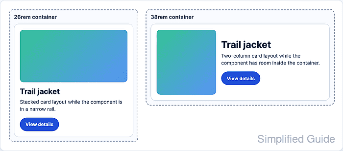
A size query container is created with container-type. The inline-size value is the common choice for width-driven components because it queries the container's inline axis without requiring block-size containment.
The container-name property is optional, but a name keeps the @container rule attached to the intended component when nested layouts have several query containers. Container queries style descendants of the query container, so put the query container on a wrapper or component root and adapt inner elements such as the body, media, actions, or metadata.
Related: How to set responsive CSS breakpoints
Related: How to create an auto-fit CSS grid layout
Related: How to scope CSS rules to a component
Steps to adapt a CSS component with container queries:
- Choose the component wrapper and the width where its internal layout should change.
Use a 34rem threshold when the card has enough room for a 12rem media track and readable text. Pick the threshold from the component content, not from a device name, so the rule still works inside sidebars, cards, modals, and split panes.
- Add markup with an outer component root and inner elements that can change layout.
<article class="product-card">
  <div class="product-card__body">
    <img class="product-card__media" src="/images/trail-jacket.jpg" alt="Trail jacket">
    <div class="product-card__content">
      <h2>Trail jacket</h2>
      <p>Water-resistant shell with a packable hood.</p>
      <a class="product-card__link" href="/products/trail-jacket">View details</a>
    </div>
  </div>
</article>
- Turn the component root into a named inline-size query container.
.product-card {
  container-type: inline-size;
  container-name: product-card;
  overflow: hidden;
  border: 1px solid #ccd5e5;
  border-radius: 0.875rem;
  background: #fff;
}
Use the shorthand container: product-card / inline-size; only when the team is already comfortable reading the name/type order.
- Write the default narrow layout before any container query.
.product-card__body {
  display: grid;
  gap: 1rem;
  padding: 1rem;
}

.product-card__media {
  inline-size: 100%;
  aspect-ratio: 4 / 3;
  object-fit: cover;
  border-radius: 0.75rem;
}
- Add the container query for wider component instances.
@container product-card (min-width: 34rem) {
  .product-card__body {
    grid-template-columns: 12rem minmax(0, 1fr);
    align-items: center;
  }

  .product-card__media {
    aspect-ratio: 1 / 1;
  }
}
The selector inside @container matches descendants of the query container. To change the outer card itself, put an extra wrapper around it and make that wrapper the query container.
- Place one instance below and one instance above the threshold while the viewport stays the same.
<div class="card-demo card-demo--compact">
  <article class="product-card">
    <div class="product-card__body">
      <img class="product-card__media" src="/images/trail-jacket.jpg" alt="Trail jacket">
      <div class="product-card__content">
        <h2>Trail jacket</h2>
        <p>Water-resistant shell with a packable hood.</p>
        <a class="product-card__link" href="/products/trail-jacket">View details</a>
      </div>
    </div>
  </article>
</div>

<div class="card-demo card-demo--wide">
  <article class="product-card">
    <div class="product-card__body">
      <img class="product-card__media" src="/images/trail-jacket.jpg" alt="Trail jacket">
      <div class="product-card__content">
        <h2>Trail jacket</h2>
        <p>Water-resistant shell with a packable hood.</p>
        <a class="product-card__link" href="/products/trail-jacket">View details</a>
      </div>
    </div>
  </article>
</div>
- Set the demo container widths around the query threshold.
.card-demo--compact {
  inline-size: 26rem;
}

.card-demo--wide {
  inline-size: 38rem;
}
- Check the component in the compact container.
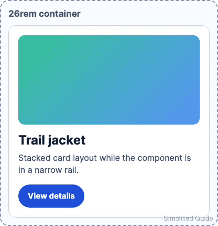
The 26rem container is below the 34rem query threshold, so the card body remains one grid column.
- Check the component in the wider container.
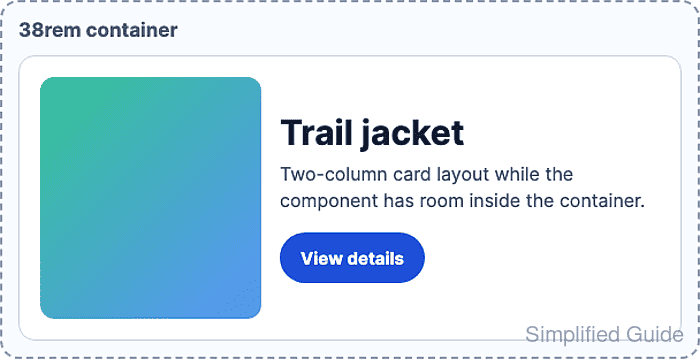
The 38rem container is above the 34rem query threshold, so the card body changes to a two-column grid even though the viewport did not change.
- Verify the applied layout in the browser DevTools Console.
const compactColumns = getComputedStyle(
  document.querySelector(".card-demo--compact .product-card__body")
).gridTemplateColumns.split(" ").length;

const wideColumns = getComputedStyle(
  document.querySelector(".card-demo--wide .product-card__body")
).gridTemplateColumns.split(" ").length;

`${compactColumns} column / ${wideColumns} columns`;
"1 column / 2 columns"