Responsive interfaces often switch navigation, spacing, and controls at breakpoints that a desktop-sized browser never reaches. Chrome mobile emulation gives a Selenium session phone-sized screen metrics, touch capability, and mobile browser identity so those branches can be exercised in an automated test.
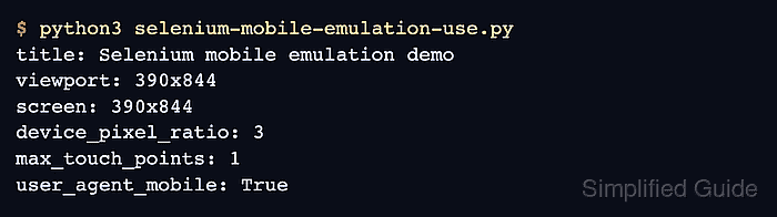
ChromeDriver reads the mobileEmulation dictionary from ChromeOptions when the browser session starts. Explicit device metrics avoid differences between the named-device lists bundled with Chrome versions, while Android mobile Client Hints let ChromeDriver infer a matching User-Agent string.
Emulation remains desktop Chrome rather than a physical phone. It can confirm responsive CSS, viewport metrics, touch capability, and browser identity, but it cannot reproduce mobile hardware, OS dialogs, virtual keyboards, or Safari on iOS.
Steps to use Chrome mobile emulation in Selenium:
- Create selenium-mobile-emulation-use.py with explicit device metrics and Chrome startup options.
- selenium-mobile-emulation-use.py
import shutil
from urllib.parse import quote

from selenium import webdriver
from selenium.webdriver.chrome.options import Options
from selenium.webdriver.chrome.service import Service


mobile_emulation = {
    "deviceMetrics": {
        "width": 390,
        "height": 844,
        "pixelRatio": 3.0,
        "mobile": True,
        "touch": True,
    },
    "clientHints": {"platform": "Android", "mobile": True},
}

options = Options()
options.add_argument("--headless=new")
options.add_experimental_option("mobileEmulation", mobile_emulation)

for browser_name in ("google-chrome", "chromium", "chromium-browser"):
    browser_path = shutil.which(browser_name)
    if browser_path:
        options.binary_location = browser_path
        break

driver_path = shutil.which("chromedriver")
service = Service(driver_path) if driver_path else Service()
The mobileEmulation option must be set before webdriver.Chrome() creates the session. Explicit metrics keep the profile stable when Chrome changes its named-device list.
- Add the responsive proof page below the Service setup.
HTML = """<!doctype html>
<html lang="en">
  <head>
    <meta charset="utf-8">
    <meta name="viewport" content="width=device-width, initial-scale=1">
    <title>Selenium mobile emulation check</title>
    <style>
      #mobile-marker { display: none; }
      @media (max-width: 600px) {
        #mobile-marker { display: block; }
      }
    </style>
  </head>
  <body>
    <p id="mobile-marker">mobile layout active</p>
  </body>
</html>
"""
- Add the browser session and fail-capable signal checks below the proof page.
with webdriver.Chrome(service=service, options=options) as driver:
    driver.get("data:text/html;charset=utf-8," + quote(HTML))
    signals = driver.execute_script(
        """
        const marker = document.querySelector("#mobile-marker");
        return {
          viewport: `${window.innerWidth}x${window.innerHeight}`,
          pixelRatio: window.devicePixelRatio,
          maxTouchPoints: navigator.maxTouchPoints,
          mobileUserAgent: navigator.userAgent.includes("Mobile"),
          markerVisible: getComputedStyle(marker).display === "block"
        };
        """
    )

expected = {
    "viewport": "390x844",
    "pixelRatio": 3,
    "maxTouchPoints": 1,
    "mobileUserAgent": True,
    "markerVisible": True,
}
if signals != expected:
    raise RuntimeError(f"mobile emulation mismatch: {signals!r}")

print(f"viewport: {signals['viewport']}")
print(f"device_pixel_ratio: {signals['pixelRatio']}")
print(f"max_touch_points: {signals['maxTouchPoints']}")
print(f"user_agent_mobile: {signals['mobileUserAgent']}")
print(f"responsive_marker_visible: {signals['markerVisible']}")
The proof-page URL and marker assertion are the two project-specific substitutions when this profile is moved into an application test.
- Run the completed script to verify the 390×844 viewport, input-point count, mobile user agent, and responsive marker.
$ python3 selenium-mobile-emulation-use.py
viewport: 390x844
device_pixel_ratio: 3
max_touch_points: 1
user_agent_mobile: True
responsive_marker_visible: True

Mohd Shakir Zakaria is a cloud architect with deep roots in software development and open-source advocacy. Certified in AWS, Red Hat, VMware, ITIL, and Linux, he specializes in designing and managing robust cloud and on-premises infrastructures.


