Annotations draw attention to a specific value without separating the explanation from the plot. A well-placed label can identify a peak, threshold, or unusual point while the surrounding series remains visible.
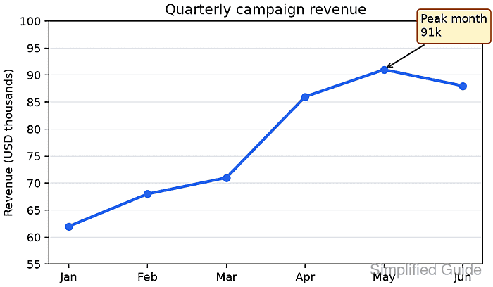
The Axes.annotate() method treats the target and the label as separate positions. xy identifies the point being described, while xytext controls where the text appears and arrowprops connects the two positions.
Selecting the highest value from the data keeps the callout attached to the peak when the values change. Setting textcoords=“offset points” keeps the label a fixed physical distance from the marker even when the data range changes.
Related: How to create a line chart in Matplotlib
Related: How to set axis labels in Matplotlib
Related: How to save a Matplotlib figure
Steps to add a Matplotlib annotation:
- Save the plot setup as annotation-add.py.
- annotation-add.py
from pathlib import Path

import matplotlib
import matplotlib.pyplot as plt

months = ["Jan", "Feb", "Mar", "Apr", "May", "Jun"]
revenue = [62, 68, 71, 86, 91, 88]

fig, ax = plt.subplots(figsize=(6, 3.5), layout="constrained")
ax.plot(months, revenue, marker="o", linewidth=2.5, color="#2563eb")
- Add the peak-value selection after the ax.plot() call.
peak_index = revenue.index(max(revenue))
peak_month = months[peak_index]
peak_value = revenue[peak_index]
list.index() returns the first matching position when the maximum value occurs more than once.
- Add the annotation after the peak-value selection.
annotation = ax.annotate(
    f"Peak month\n{peak_value}k",
    xy=(peak_month, peak_value),
    xytext=(32, 26),
    textcoords="offset points",
    arrowprops={"arrowstyle": "->", "color": "#1f2937", "linewidth": 1.3},
    bbox={"boxstyle": "round,pad=0.3", "fc": "#fef3c7", "ec": "#92400e"},
    ha="left",
    va="bottom",
)
xy uses the plot's data coordinates. The xytext pair moves the text 32 points right and 26 points up from that anchor.
- Add the chart formatting after the annotation.
ax.set_ylabel("Revenue (USD thousands)")
ax.set_title("Quarterly campaign revenue")
ax.grid(True, axis="y", color="#e5e7eb")
ax.set_ylim(55, 100)
- Append the figure export after the chart formatting.
output = Path("annotation-add.png")
fig.savefig(output, dpi=160)
plt.close(fig)
- Append the diagnostic output after the figure export.
print(f"matplotlib: {matplotlib.__version__}")
print(f"annotation: {annotation.get_text().replace(chr(10), ' / ')}")
print(f"anchor: {annotation.xy}")
print(f"offset points: {annotation.get_position()}")
print(f"saved: {output} ({output.stat().st_size} bytes)")
- Run annotation-add.py from the directory that should receive the image.
$ python3 annotation-add.py
matplotlib: 3.10.7+dfsg1
annotation: Peak month / 91k
anchor: ('May', 91)
offset points: (32, 26)
saved: annotation-add.png (49585 bytes)
The byte count can vary with the Matplotlib release, fonts, backend, and image metadata.
- Open annotation-add.png in an image viewer.
- Confirm the callout labels the May peak and points back to the 91 marker.

Mohd Shakir Zakaria is a cloud architect with deep roots in software development and open-source advocacy. Certified in AWS, Red Hat, VMware, ITIL, and Linux, he specializes in designing and managing robust cloud and on-premises infrastructures.


