Tabbed interfaces let one page expose several related panels without sending readers through separate screens. An accessible JavaScript version keeps the visible tab, keyboard focus, and assistive-technology state synchronized so the selected label and displayed panel never drift apart.
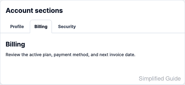
The tab pattern uses a tablist container, one tab for each control, and one tabpanel for each content area. aria-selected marks the active tab, aria-controls connects a tab to its panel, and the hidden attribute keeps inactive panels out of the rendered page.
This implementation uses automatic activation for a small in-page tab set where every panel is already available. Arrow keys move across the tabs and activate the next panel immediately, while Tab leaves the tablist and moves into the selected panel.
Steps to create accessible JavaScript tabs:
- Add the tablist, tab buttons, and tab panels to the HTML.
- index.html
<section class="tabs" aria-labelledby="account-tabs-title" data-tabs>
  <h2 id="account-tabs-title">Account sections</h2>

  <div class="tabs__list" role="tablist" aria-labelledby="account-tabs-title">
    <button
      class="tabs__tab"
      id="account-tab-profile"
      type="button"
      role="tab"
      aria-selected="true"
      aria-controls="account-panel-profile"
      tabindex="0"
      data-tab>
      Profile
    </button>
    <button
      class="tabs__tab"
      id="account-tab-billing"
      type="button"
      role="tab"
      aria-selected="false"
      aria-controls="account-panel-billing"
      tabindex="-1"
      data-tab>
      Billing
    </button>
    <button
      class="tabs__tab"
      id="account-tab-security"
      type="button"
      role="tab"
      aria-selected="false"
      aria-controls="account-panel-security"
      tabindex="-1"
      data-tab>
      Security
    </button>
  </div>

  <section
    class="tabs__panel"
    id="account-panel-profile"
    role="tabpanel"
    tabindex="0"
    aria-labelledby="account-tab-profile"
    data-panel>
    <h3>Profile</h3>
    <p>Update the name, email address, and public avatar for the account.</p>
  </section>

  <section
    class="tabs__panel"
    id="account-panel-billing"
    role="tabpanel"
    tabindex="0"
    aria-labelledby="account-tab-billing"
    data-panel
    hidden>
    <h3>Billing</h3>
    <p>Review the active plan, payment method, and next invoice date.</p>
  </section>

  <section
    class="tabs__panel"
    id="account-panel-security"
    role="tabpanel"
    tabindex="0"
    aria-labelledby="account-tab-security"
    data-panel
    hidden>
    <h3>Security</h3>
    <p>Manage two-factor authentication and recent sign-in sessions.</p>
  </section>
</section>
The selected tab starts with tabindex="0" so one Tab keypress enters the tablist. Inactive tabs use tabindex="-1" and are reached with arrow keys instead of extra Tab stops.
- Add visible styles for the active tab, panel, and keyboard focus.
- styles.css
.tabs {
  max-width: 44rem;
  border: 1px solid #d2dbe8;
  border-radius: 0.75rem;
  background: #ffffff;
}

.tabs__list {
  display: flex;
  gap: 0.35rem;
  padding: 1rem 1rem 0;
  border-bottom: 1px solid #d2dbe8;
}

.tabs__tab {
  margin-block-end: -1px;
  padding: 0.75rem 1rem;
  border: 1px solid transparent;
  border-radius: 0.55rem 0.55rem 0 0;
  background: transparent;
  color: #475569;
  cursor: pointer;
  font: inherit;
  font-weight: 700;
}

.tabs__tab[aria-selected="true"] {
  border-color: #d2dbe8;
  border-bottom-color: #ffffff;
  background: #ffffff;
  color: #0f172a;
}

.tabs__tab:focus-visible,
.tabs__panel:focus-visible {
  outline: 3px solid #2563eb;
  outline-offset: 3px;
}

.tabs__panel {
  padding: 1.25rem 1rem;
}

.tabs__panel[hidden] {
  display: none;
}
The explicit [hidden] rule prevents component styles from accidentally overriding the browser's hidden-state behavior.
- Select the tab buttons in JavaScript.
- tabs.js
const tabs = Array.from(document.querySelectorAll("[data-tab]"));

function selectTab(selectedTab, moveFocus = true) {
  tabs.forEach((tab) => {
    const panelId = tab.getAttribute("aria-controls");
    const panel = document.getElementById(panelId);
    const isSelected = tab === selectedTab;

    tab.setAttribute("aria-selected", String(isSelected));
    tab.tabIndex = isSelected ? 0 : -1;

    if (panel) {
      panel.hidden = !isSelected;
    }
  });

  if (moveFocus) {
    selectedTab.focus({ preventScroll: true });
  }
}
selectTab() updates the visual panel and the programmatic tab state together. Missing panels are skipped so one broken aria-controls value does not stop the rest of the tab group from initializing.
- Add click activation for pointer and touch users.
- tabs.js
tabs.forEach((tab) => {
  tab.addEventListener("click", () => {
    selectTab(tab, false);
  });
});
A native button fires the click handler for mouse, touch, Enter, and Space activation. The click path does not need to move focus because the browser has already focused the clicked button.
Related: How to add a JavaScript event listener - Add horizontal arrow, Home, and End keyboard navigation.
- tabs.js
tabs.forEach((tab, index) => {
  tab.addEventListener("keydown", (event) => {
    let nextIndex = null;

    if (event.key === "ArrowRight") {
      nextIndex = (index + 1) % tabs.length;
    } else if (event.key === "ArrowLeft") {
      nextIndex = (index - 1 + tabs.length) % tabs.length;
    } else if (event.key === "Home") {
      nextIndex = 0;
    } else if (event.key === "End") {
      nextIndex = tabs.length - 1;
    }

    if (nextIndex === null) {
      return;
    }

    event.preventDefault();
    selectTab(tabs[nextIndex]);
  });
});
A horizontal tablist should leave ArrowUp and ArrowDown alone so the browser can still scroll the page while focus is inside the tablist.
- Load the stylesheet and deferred script from the HTML page.
- index.html
<link rel="stylesheet" href="styles.css">
<script src="tabs.js" defer></script>
defer waits until the tab markup exists before the script runs, while still letting the browser continue parsing the page.
- Open the page and click Billing.
Click selected tab: account-tab-billing
- Press ArrowRight from Billing and confirm the Security panel is the only visible panel.
ArrowRight selected tab: account-tab-security
Visible panel after ArrowRight: account-panel-security
Hidden panels after ArrowRight: profile=true, billing=true, security=false
- Press Home and confirm the roving tabindex returned to Profile.
Home selected tab: account-tab-profile
Roving tabindex after Home: profile=0, billing=-1, security=-1
- Press Tab and confirm focus moves into the selected panel.
Tab focus target: account-panel-profile
The selected panel uses tabindex="0" because its first meaningful content is not otherwise focusable. Remove that attribute when the panel starts with a natural focus target such as a form field or link.

Mohd Shakir Zakaria is a cloud architect with deep roots in software development and open-source advocacy. Certified in AWS, Red Hat, VMware, ITIL, and Linux, he specializes in designing and managing robust cloud and on-premises infrastructures.


