Accordion sections let a page group related content behind short headings without making keyboard users hunt for hidden controls. An accessible accordion uses a real button for each heading, exposes whether the related panel is open, and leaves visible panel content reachable through normal keyboard navigation.
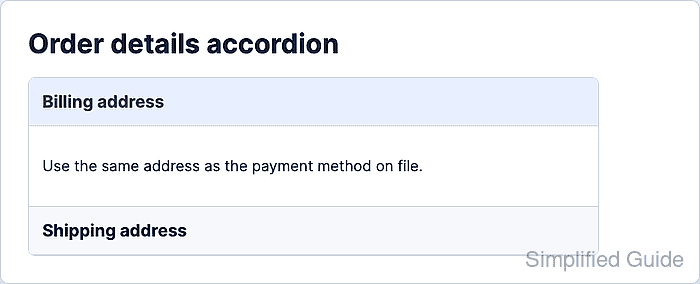
A native heading and button structure keeps the control discoverable to both browsers and assistive technology. aria-expanded belongs on the button, aria-controls points at the panel, and the hidden attribute removes collapsed panel content from rendering until it opens.
The implementation allows multiple panels to stay open, which fits FAQ, settings, and help screens where readers may compare sections. Add single-open behavior only when product requirements need it, and test the component with mouse, Enter, Space, and Tab before reusing it.
Steps to create an accessible JavaScript accordion:
- Add accordion headings, buttons, and panels to the HTML.
<section class="accordion" data-accordion>
  <h2 class="accordion__heading">
    <button
      class="accordion__trigger"
      id="accordion-trigger-billing"
      type="button"
      aria-expanded="false"
      aria-controls="accordion-panel-billing"
      data-accordion-trigger>
      Billing address
    </button>
  </h2>
  <div
    class="accordion__panel"
    id="accordion-panel-billing"
    role="region"
    aria-labelledby="accordion-trigger-billing"
    hidden>
    <p>Use the same address as the payment method on file.</p>
  </div>

  <h2 class="accordion__heading">
    <button
      class="accordion__trigger"
      id="accordion-trigger-shipping"
      type="button"
      aria-expanded="false"
      aria-controls="accordion-panel-shipping"
      data-accordion-trigger>
      Shipping address
    </button>
  </h2>
  <div
    class="accordion__panel"
    id="accordion-panel-shipping"
    role="region"
    aria-labelledby="accordion-trigger-shipping"
    hidden>
    <p>Send this order to the default warehouse pickup address.</p>
  </div>
</section>
Keep each button as the only element inside its heading. The aria-controls value must match the panel id, and aria-labelledby should point back to the button when the panel uses role=“region”.
- Add styles for the panel and visible keyboard focus.
.accordion {
  max-width: 42rem;
  border: 1px solid #d5dbe3;
  border-radius: 0.5rem;
}

.accordion__heading {
  margin: 0;
}

.accordion__trigger {
  display: block;
  width: 100%;
  padding: 1rem;
  border: 0;
  border-bottom: 1px solid #d5dbe3;
  background: #f6f8fb;
  color: #172033;
  font: inherit;
  font-weight: 700;
  text-align: left;
}

.accordion__trigger:focus-visible {
  outline: 3px solid #2563eb;
  outline-offset: -3px;
}

.accordion__panel {
  padding: 1rem;
  border-bottom: 1px solid #d5dbe3;
}

.accordion__panel[hidden] {
  display: none;
}
The explicit [hidden] rule prevents component styles from accidentally overriding the browser's hidden-state rule.
- Add the JavaScript toggle handler.
const triggers = document.querySelectorAll("[data-accordion-trigger]");

function setAccordionState(trigger, expanded) {
  const panelId = trigger.getAttribute("aria-controls");
  const panel = document.getElementById(panelId);

  if (!panel) {
    return;
  }

  trigger.setAttribute("aria-expanded", String(expanded));
  panel.hidden = !expanded;
}

triggers.forEach((trigger) => {
  trigger.addEventListener("click", () => {
    const isExpanded = trigger.getAttribute("aria-expanded") === "true";
    setAccordionState(trigger, !isExpanded);
  });
});
Native buttons fire the click handler for mouse, touch, Enter, and Space activation, so a basic accordion does not need a custom keydown handler.
Related: How to add a JavaScript event listener - Open the page and click Billing address.
- Check that the opened button and panel state match.
> document.querySelector("#accordion-trigger-billing").getAttribute("aria-expanded") "true" > document.querySelector("#accordion-panel-billing").hidden false - Move focus to Shipping address with Tab.
- Press Enter to open the focused panel.
- Press Space to collapse the focused panel and confirm the state returned to closed.
> document.querySelector("#accordion-trigger-shipping").getAttribute("aria-expanded")
"false"
> document.querySelector("#accordion-panel-shipping").hidden
true

Mohd Shakir Zakaria is a cloud architect with deep roots in software development and open-source advocacy. Certified in AWS, Red Hat, VMware, ITIL, and Linux, he specializes in designing and managing robust cloud and on-premises infrastructures.


