Layout shift happens when visible content moves after the browser has already painted a page. In CSS work, the usual triggers are media without reserved dimensions, late banners or notices, web fonts with different metrics, and animations that change layout properties.
Chromium-based browsers expose layout-shift entries in DevTools Performance recordings and through PerformanceObserver. Reproduce the jump with the same viewport, route, content state, and loading speed that produced the user-visible movement, because a stable desktop view can still shift on a narrow viewport or a slower font and image load.
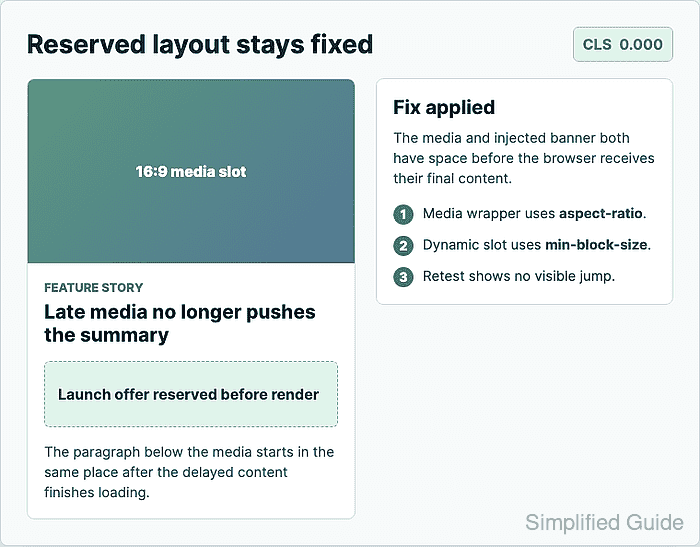
The repair is to reserve the final box size before late content arrives and keep visual changes out of normal document flow. Use dimensions, aspect-ratio, min-block-size, close font fallbacks, and transform or opacity animations, then retest the same scenario until the affected elements no longer move.
Related: How to set CSS aspect ratio for responsive media
Related: How to load a web font with CSS
Related: How to add a CSS animation
Steps to fix CSS layout shift:
- Reproduce the shift in the browser.
Open DevTools → Performance, record the page load or interaction that jumps, and inspect the Layout Shifts track for the moved element and its source. Keep the viewport, test route, dynamic content, and throttling settings unchanged for the retest.
- Identify the content that arrives late or changes size.
Check unsized images, videos, iframes, ads, cookie notices, alert banners, web-font text, expandable panels, and animations that change height, margin, top, left, width, or padding.
- Add intrinsic dimensions to media markup.
<img
  class="article-image"
  src="/images/product-photo.jpg"
  alt="Product photo"
  width="1200"
  height="675">
The browser can calculate a temporary ratio from width and height before the image file finishes loading. Use dimensions that match the image's real crop.
- Reserve the responsive media box in CSS.
.article-media {
  inline-size: min(100%, 48rem);
  aspect-ratio: 16 / 9;
  overflow: hidden;
}

.article-media > img,
.article-media > video,
.article-media > iframe {
  inline-size: 100%;
  block-size: 100%;
  display: block;
  border: 0;
}

.article-media > img,
.article-media > video {
  object-fit: cover;
}
Use object-fit: contain when the whole image or video must stay visible without cropping.
Related: How to set CSS aspect ratio for responsive media - Reserve space for injected content.
.promo-slot {
  min-block-size: 4.5rem;
  display: grid;
  align-content: center;
}

.promo-slot > * {
  margin-block: 0;
}
Set the reservation on the slot that already exists in the page, not only on the banner that appears later. Adjust min-block-size to the tallest expected state at the tested breakpoint.
- Limit font-driven movement near the shifted area.
@font-face {
  font-family: "Brand Sans";
  src: url("/fonts/brand-sans.woff2") format("woff2");
  font-display: optional;
}

.article-title {
  font-family: "Brand Sans", Inter, system-ui, sans-serif;
  line-height: 1.15;
}
font-display: optional can skip a late web-font swap on slow loads. Use swap when the brand font must replace fallback text, but keep a similar fallback family and a fixed line-height.
Related: How to load a web font with CSS - Move animated UI inside a reserved slot.
.notice-slot {
  min-block-size: 3.5rem;
}

.notice {
  opacity: 1;
  transform: translateY(0);
  transition: opacity 180ms ease, transform 180ms ease;
}

.notice[data-state="entering"] {
  opacity: 0;
  transform: translateY(.5rem);
}
Animate transform and opacity for the visible effect. Avoid opening the slot with animated height, margin, or positioned offsets after the surrounding content has painted.
Related: How to add a CSS animation - Retest the same scenario with a buffered layout-shift observer.
await new Promise((resolve) => {
  let cls = 0;
  const observer = new PerformanceObserver((list) => {
    for (const entry of list.getEntries()) {
      if (!entry.hadRecentInput) cls += entry.value;
    }
  });
  observer.observe({ type: "layout-shift", buffered: true });
  setTimeout(() => {
    observer.disconnect();
    resolve(cls.toFixed(3));
  }, 500);
});
"0.000"
A non-zero value means the retest still produced unexpected movement. Return to the shifted element in the Performance recording and reserve the box that changed size.

Mohd Shakir Zakaria is a cloud architect with deep roots in software development and open-source advocacy. Certified in AWS, Red Hat, VMware, ITIL, and Linux, he specializes in designing and managing robust cloud and on-premises infrastructures.


