CSS animations let an element move between named keyframes without JavaScript timers. They fit focused state changes such as a notification entering the page, where the element should finish in a predictable visible state.
A named @keyframes block defines the visual frames, and the element state chooses when that sequence runs. Put the usable final appearance in the base rule first, then attach animation only to the state class that needs motion.
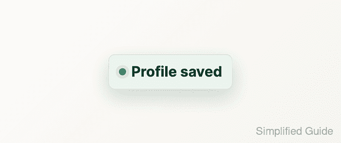
This pattern animates a saved-message component with opacity and transform, keeps layout properties out of the animation, and disables motion when the browser reports a reduced-motion preference. The component stays readable whether the animation runs, is skipped, or is inspected after it finishes.
Related: How to add a CSS transition
Related: How to respect reduced motion with CSS
Steps to add a CSS animation:
- Add a stable class and a state class to the element that should animate.
<div class="notice is-visible" role="status">
  Profile saved
</div>
The base class names the component. The state class controls when the animation runs, so JavaScript or server-rendered markup can add or remove motion without changing the CSS selector.
- Set the element's final visual state before adding keyframes.
.notice {
  display: inline-flex;
  align-items: center;
  gap: 0.5rem;
  max-width: 24rem;
  padding: 0.875rem 1rem;
  border-radius: 0.75rem;
  color: #113a2c;
  background: #e7f7ef;
  box-shadow: 0 0.75rem 2rem rgb(17 58 44 / 0.14);
  opacity: 1;
  transform: translateY(0);
}
The non-animated state should already be usable. The keyframes can start from a hidden or shifted state, but the normal rule keeps the component visible when animation is disabled.
- Define a named @keyframes block for the movement.
@keyframes notice-enter {
  from {
    opacity: 0;
    transform: translateY(0.75rem);
  }

  to {
    opacity: 1;
    transform: translateY(0);
  }
}
Animate opacity and transform when possible because they avoid forcing layout recalculation on every frame.
- Attach the animation to the state class.
.notice.is-visible {
  animation: 220ms ease-out both notice-enter;
}
both applies the first keyframe during any delay and keeps the last keyframe after the animation completes. Use forwards instead when there is no need to apply the starting frame before a delay.
- Disable the animation for reduced-motion users.
@media (prefers-reduced-motion: reduce) {
  .notice.is-visible {
    animation: none;
  }
}
Keep the final state in the base .notice rule instead of hiding the element in the reduced-motion override.
- Load the page and confirm the browser applies the named animation.
> ({ name: getComputedStyle(document.querySelector(".notice")).animationName, duration: getComputedStyle(document.querySelector(".notice")).animationDuration, fill: getComputedStyle(document.querySelector(".notice")).animationFillMode }) {name: "notice-enter", duration: "0.22s", fill: "both"} - Emulate reduced motion and confirm the element stays visible without an animation.
> ({
  reduced: matchMedia("(prefers-reduced-motion: reduce)").matches,
  animation: getComputedStyle(document.querySelector(".notice")).animationName,
  opacity: getComputedStyle(document.querySelector(".notice")).opacity
})
{reduced: true, animation: "none", opacity: "1"}
In Chromium DevTools, use Rendering → Emulate CSS media feature prefers-reduced-motion → reduce.

Mohd Shakir Zakaria is a cloud architect with deep roots in software development and open-source advocacy. Certified in AWS, Red Hat, VMware, ITIL, and Linux, he specializes in designing and managing robust cloud and on-premises infrastructures.


