How to format tick labels in Matplotlib
Axis values often need reader-facing text instead of the raw numbers stored in a dataset. A Matplotlib Axes object can pair fixed positions with category names and transform numeric tick values into compact units such as thousands of dollars.

Fixed labels suit ticks with one known name per position, such as Q1 through Q4. A formatter is better for numeric axes because it generates every visible label from the tick value and keeps working when the displayed values change.
The fixed label list must contain one string for every location passed to set_xticks(). FuncFormatter receives a numeric value plus its tick position, so the same formatting function can add a prefix, suffix, unit conversion, or rounding rule across an axis.
Steps to format Matplotlib tick labels:
- Create format_tick_labels.py with the data and initial line plot.
- format_tick_labels.py
import matplotlib.pyplot as plt
from matplotlib.ticker import FuncFormatter


quarters = [1, 2, 3, 4]
revenue = [12500, 18100, 23600, 31200]

fig, ax = plt.subplots(layout="constrained")
ax.plot(quarters, revenue, marker="o", linewidth=2)
- Insert the fixed quarter-name ticks immediately after the ax.plot() call.
ax.set_xticks(quarters, labels=["Q1", "Q2", "Q3", "Q4"])
The labels list must match the number of tick locations. Fixed labels are appropriate here because each quarter has one stable name.
- Insert the revenue tick formatter below the x-axis tick line.
ax.set_yticks([0, 10000, 20000, 30000, 40000])


def dollars_in_thousands(value, _position):
    return f"${value / 1000:.0f}k"


ax.yaxis.set_major_formatter(FuncFormatter(dollars_in_thousands))
A plain format string passed to set_major_formatter() creates a StrMethodFormatter automatically. FuncFormatter is appropriate when the visible label also converts the numeric value.
- Append the final chart-output block below the formatter.
ax.set_xlabel("Quarter")
ax.set_ylabel("Revenue")
ax.set_title("Quarterly revenue with formatted tick labels")

fig.savefig("formatted-revenue-ticks.png", dpi=160)
fig.canvas.draw()

print("xlabels=" + ", ".join(tick.get_text() for tick in ax.get_xticklabels()))
print("ylabels=" + ", ".join(tick.get_text() for tick in ax.get_yticklabels()))
print("saved=formatted-revenue-ticks.png")
- Run the completed script from its containing directory.
$ python3 format_tick_labels.py
xlabels=Q1, Q2, Q3, Q4
ylabels=$0k, $10k, $20k, $30k, $40k
saved=formatted-revenue-ticks.png
- Inspect formatted-revenue-ticks.png for quarter labels plus dollar values in thousands.
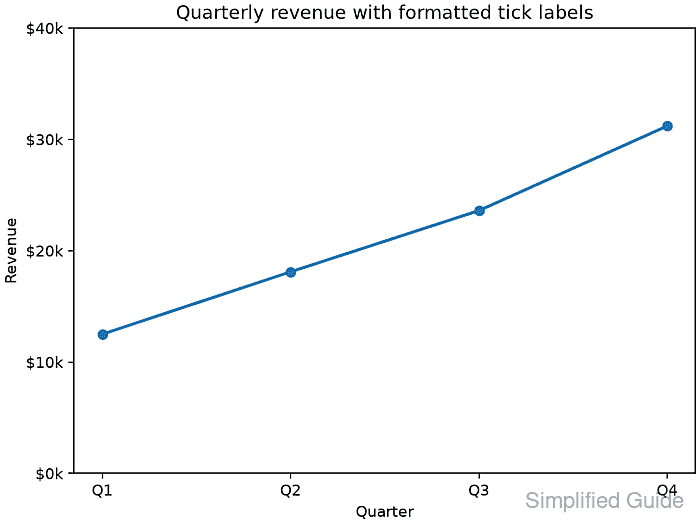
The x-axis should show Q1 through Q4, while the y-axis should show $0k through $40k. Longer labels may need layout="constrained" or a separate layout adjustment before export.
Related: How to fix overlapping labels in Matplotlib