How to set axis labels in Matplotlib
A line chart can show a clear trend while leaving its coordinate system ambiguous. The horizontal label should name the category or independent variable, while the vertical label should name the measured quantity and its unit.
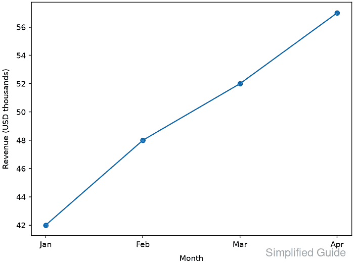
Label text belongs to the Axes that displays the data. Keeping the text in variables beside the plotted values makes the relationship explicit and reduces the chance of placing a quantity on the wrong coordinate direction.
The set_xlabel() and set_ylabel() methods attach those strings to one Axes object, and labelpad adjusts their clearance from the axis box in points. The matching getter methods expose the stored text, so a script can reject missing or swapped labels before exporting the figure.
Steps to label both axes in Matplotlib:
- Initialize axis_labels.py with the monthly revenue chart inputs.
- axis_labels.py
import matplotlib.pyplot as plt

months = ["Jan", "Feb", "Mar", "Apr"]
revenue = [42, 48, 52, 57]

x_label = "Month"
y_label = "Revenue (USD thousands)"
- Create one Axes for the monthly revenue series after the label definitions.
fig, ax = plt.subplots(layout="constrained")
ax.plot(months, revenue, marker="o")
- Attach the category text to the horizontal axis.
ax.set_xlabel(x_label, labelpad=8)
- Attach the measured quantity and unit to the vertical axis.
ax.set_ylabel(y_label, labelpad=8)
labelpad sets the spacing in points between a label and the axis box containing its ticks and tick labels.
- Reject missing or swapped labels before the figure is exported.
actual_labels = (ax.get_xlabel(), ax.get_ylabel())
expected_labels = (x_label, y_label)

if actual_labels != expected_labels:
    raise RuntimeError(f"Unexpected axis labels: {actual_labels}")
- Save the labelled figure as axis-set-label.png.
output = "axis-set-label.png"
fig.savefig(output, dpi=150)

print(f"labels: {actual_labels[0]} | {actual_labels[1]}")
print(f"saved: {output}")
Related: How to save a Matplotlib figure
- Run axis_labels.py to create the verified labelled plot.
$ python3 axis_labels.py
labels: Month | Revenue (USD thousands)
saved: axis-set-label.png
- Verify the exported chart places each label beside its matching coordinate direction.
Month should appear below the categories, and Revenue (USD thousands) should appear beside the numeric scale. layout="constrained" reserves room for both labels during export.
Related: How to fix overlapping labels in Matplotlib