How to theme a page with CSS custom properties
Page themes become harder to change when the same colors are repeated across cards, buttons, and section backgrounds. CSS custom properties turn those repeated values into named tokens that can be inherited, overridden, and inspected in the browser while normal CSS rules still control the layout.
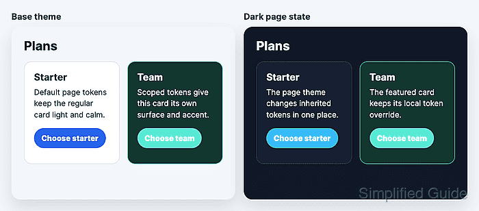
Custom properties are declared with two leading dashes, such as --page-bg, and consumed inside normal property values with var(--page-bg). Because they participate in the cascade, a token on :root can set the default theme while a nearer selector can replace only the values needed for one page state or component.
A small pricing section keeps theme tokens on :root, consumes them in section and card styles, and overrides them in a dark page state plus a featured card. Browser computed styles prove which token wins after inheritance, cascade, and var() substitution.
Related: How to style an HTML button with CSS
Related: How to support system dark mode with CSS
Related: How to style a dark mode toggle with CSS
Steps to theme a page with CSS custom properties:
- Add the themed page markup.
<main class="pricing-page" data-theme="light">
  <h1>Plans</h1>
  <section class="pricing-grid" aria-label="Pricing plans">
    <article class="pricing-card">
      <h2>Starter</h2>
      <p>Default page tokens keep the regular card light and calm.</p>
      <a class="pricing-card__button" href="/signup">Choose starter</a>
    </article>

    <article class="pricing-card pricing-card--featured">
      <h2>Team</h2>
      <p>Scoped tokens give this card its own surface and accent.</p>
      <a class="pricing-card__button" href="/signup">Choose team</a>
    </article>
  </section>
</main>
The data-theme attribute gives the page a clear state hook without tying the theme to body-wide classes or unrelated layout selectors.
- Define the default theme tokens.
- styles.css
:root {
  --page-bg: #f4f7fb;
  --page-text: #14213d;
  --card-bg: #ffffff;
  --card-text: #1f2937;
  --card-border: #d8e0eb;
  --accent: #2563eb;
  --focus-ring: #f59e0b;
}
Keep token names tied to their job, such as --card-bg or --focus-ring, rather than to one temporary color name.
- Apply the tokens to the page and card rules.
- styles.css
.pricing-page {
  padding: 2rem;
  background: var(--page-bg);
  color: var(--page-text);
}

.pricing-grid {
  display: grid;
  gap: 1rem;
  grid-template-columns: repeat(2, minmax(0, 1fr));
}

.pricing-card {
  padding: 1.25rem;
  border: 1px solid var(--card-border);
  border-radius: 1rem;
  background: var(--card-bg);
  color: var(--card-text);
}

.pricing-card__button {
  display: inline-flex;
  min-height: 2.75rem;
  align-items: center;
  justify-content: center;
  padding: 0.65rem 0.95rem;
  border-radius: 999px;
  color: #ffffff;
  background: var(--accent, #2563eb);
  font-weight: 800;
  text-decoration: none;
}

.pricing-card__button:focus-visible {
  outline: 3px solid var(--focus-ring);
  outline-offset: 3px;
}
The fallback in var(--accent, #2563eb) is used only when --accent cannot supply a usable value. It is not a replacement for checking the rendered button color.
- Add page-state and component-scope overrides.
- styles.css
.pricing-page[data-theme="dark"] {
  --page-bg: #111827;
  --page-text: #e5e7eb;
  --card-bg: #172033;
  --card-text: #f8fafc;
  --card-border: #334155;
  --accent: #38bdf8;
  --focus-ring: #fde68a;
  color-scheme: dark;
}

.pricing-card--featured {
  --card-bg: #12372f;
  --card-text: #ecfdf5;
  --card-border: #2dd4bf;
  --accent: #5eead4;
}
The featured card override is closer to that card than the page-state tokens, so the card keeps its own surface and accent when the page changes theme.
- Check the default card background in the browser console.
> getComputedStyle(document.querySelector('.pricing-card')).backgroundColor 'rgb(255, 255, 255)' - Check the featured card background in the browser console.
> getComputedStyle(document.querySelector('.pricing-card--featured')).backgroundColor 'rgb(18, 55, 47)' - Switch the page to the dark theme state.
> document.querySelector('.pricing-page').dataset.theme = 'dark' 'dark' - Verify that the dark page tokens changed the inherited card color while the featured card stayed scoped.
> ({
  page: getComputedStyle(document.querySelector('.pricing-page')).backgroundColor,
  normalCard: getComputedStyle(document.querySelector('.pricing-card')).backgroundColor,
  featuredCard: getComputedStyle(document.querySelector('.pricing-card--featured')).backgroundColor
})
{page: 'rgb(17, 24, 39)', normalCard: 'rgb(23, 32, 51)', featuredCard: 'rgb(18, 55, 47)'}