A manual theme switcher is the control that shows whether the page is using its light or dark palette. The visual state needs to match the saved theme, stay readable on both backgrounds, and remain obvious when a keyboard user tabs to the control.
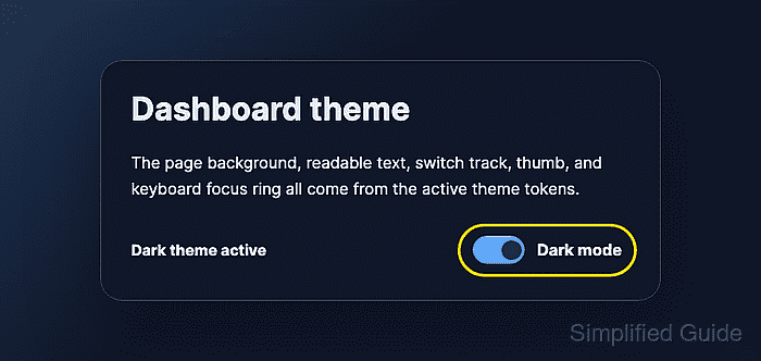
Application code should already change data-theme on the page root and update aria-checked on the switch button. Custom properties hold the color tokens, so the page background, text, switch track, switch thumb, and focus outline all follow the active theme.
Use color-scheme with the selected theme so browser-drawn controls inside the page match the same light or dark context. Replace the colors with project tokens only after checking the toggle text, track, thumb, and focus outline against the final backgrounds.
Steps to style a dark mode toggle with CSS:
- Add a focusable switch control that exposes its selected state.
<button class="theme-toggle" type="button" role="switch" aria-checked="false">
  <span class="theme-toggle__track" aria-hidden="true">
    <span class="theme-toggle__thumb"></span>
  </span>
  <span class="theme-toggle__text">Light mode</span>
</button>
The theme script should update aria-checked and the visible label whenever it changes the page theme.
- Define light theme tokens on the page root.
:root,
html[data-theme="light"] {
  color-scheme: light;
  --page-bg: #f8fafc;
  --page-text: #0f172a;
  --panel-bg: #ffffff;
  --panel-border: #cbd5e1;
  --toggle-track: #cbd5e1;
  --toggle-track-active: #2563eb;
  --toggle-thumb: #ffffff;
  --toggle-focus: #f59e0b;
}
color-scheme lets browser UI such as form controls and scrollbars use the declared light context where supported.
- Override the same tokens for dark mode.
html[data-theme="dark"] {
  color-scheme: dark;
  --page-bg: #0f172a;
  --page-text: #e5edf7;
  --panel-bg: #111827;
  --panel-border: #334155;
  --toggle-track: #475569;
  --toggle-track-active: #60a5fa;
  --toggle-thumb: #082f49;
  --toggle-focus: #facc15;
}
Keep the custom property names identical between themes so component rules do not need separate light and dark selectors.
- Apply the theme tokens to the page and switch.
body {
  margin: 0;
  color: var(--page-text);
  background: var(--page-bg);
}

.theme-toggle {
  display: inline-flex;
  align-items: center;
  gap: 0.75rem;
  border: 0;
  border-radius: 999px;
  padding: 0.35rem 0.5rem;
  color: var(--page-text);
  background: transparent;
  font: inherit;
  font-weight: 700;
  cursor: pointer;
}

.theme-toggle__track {
  display: inline-flex;
  align-items: center;
  width: 3.25rem;
  height: 1.75rem;
  padding: 0.25rem;
  border: 1px solid var(--panel-border);
  border-radius: 999px;
  background: var(--toggle-track);
  transition: background-color 160ms ease, border-color 160ms ease;
}

.theme-toggle__thumb {
  width: 1.2rem;
  height: 1.2rem;
  border-radius: 999px;
  background: var(--toggle-thumb);
  box-shadow: 0 1px 4px rgb(15 23 42 / 0.28);
  transition: transform 160ms ease;
}
- Move the thumb and active track when dark mode is selected.
.theme-toggle[aria-checked="true"] .theme-toggle__track {
  border-color: var(--toggle-track-active);
  background: var(--toggle-track-active);
}

.theme-toggle[aria-checked="true"] .theme-toggle__thumb {
  transform: translateX(1.5rem);
}
The transform distance equals the available track space after thumb width and padding are removed.
- Add a keyboard-visible focus style.
.theme-toggle:focus-visible {
  outline: 3px solid var(--toggle-focus);
  outline-offset: 4px;
}
Do not remove the browser outline unless the replacement focus ring is visible on both light and dark backgrounds.
Related: How to style keyboard focus with CSS
- Disable switch animation for reduced-motion users.
@media (prefers-reduced-motion: reduce) {
  .theme-toggle__track,
  .theme-toggle__thumb {
    transition: none;
  }
}
- Verify the light, dark, and keyboard focus states in the browser.
light color-scheme: light
light aria-checked: false
light track background: rgb(203, 213, 225)
light text contrast: 17.06:1
dark color-scheme: dark
dark aria-checked: true
dark track background: rgb(96, 165, 250)
dark thumb transform: matrix(1, 0, 0, 1, 24, 0)
dark text contrast: 15.12:1
keyboard focus outline: 3px solid rgb(250, 204, 21)
The exact RGB values will change with project colors. The selected state should still move the thumb, update the track, keep readable text, and show a visible focus outline.

Mohd Shakir Zakaria is a cloud architect with deep roots in software development and open-source advocacy. Certified in AWS, Red Hat, VMware, ITIL, and Linux, he specializes in designing and managing robust cloud and on-premises infrastructures.


