How to create a sticky header with CSS
Long pages lose navigation context when the header scrolls away before the next section or form group appears. A CSS sticky header keeps navigation or page controls visible while leaving the header's original space in the normal document flow.
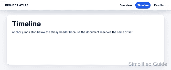
position: sticky behaves like relative positioning until the scroll position reaches the top offset. After that threshold, the header stays pinned inside the scrolling area that contains it, so the same rule can support a full-page header or a section header inside a scroll panel.
A sticky header needs an opaque background, a stack level above nearby cards, and enough scroll offset for in-page links. Parent containers also matter because an ancestor with overflow: hidden, overflow: auto, overflow: scroll, or overflow: overlay can become the boundary that limits where the header sticks.
Related: How to create a responsive CSS navigation bar
Related: How to fix CSS horizontal overflow
Related: How to debug CSS z-index layering
Steps to create a sticky CSS header:
- Add the header before the main page content.
<div class="site-shell">
  <header class="site-header">
    <a class="brand" href="/">Project Atlas</a>
    <nav class="site-nav" aria-label="Section navigation">
      <a href="#overview">Overview</a>
      <a href="#timeline">Timeline</a>
      <a href="#results">Results</a>
    </nav>
  </header>

  <main>
    <section class="section-panel" id="overview">
      <h1>Quarterly launch plan</h1>
    </section>
    <section class="section-panel" id="timeline">
      <h2>Timeline</h2>
    </section>
    <section class="section-panel" id="results">
      <h2>Results</h2>
    </section>
  </main>
</div>
Keep the header in the same scroll context as the content it should follow. A header outside a scroll panel sticks to the viewport, while a header inside a scroll panel sticks inside that panel.
- Define the sticky offset and anchor spacing.
:root {
  --sticky-offset: 0px;
  --header-height: 4rem;
  --anchor-offset: 5.75rem;
}

html {
  scroll-padding-top: var(--anchor-offset);
}
scroll-padding-top keeps hash-link and scrollIntoView() targets from sitting under the header during viewport scrolling. Use scroll-margin-top on individual targets instead when only selected sections need the offset.
- Keep the sticky header out of accidental clipping containers.
.site-shell {
  min-block-size: 100vh;
  overflow: visible;
}
Do not wrap a viewport sticky header in an ancestor with overflow: hidden or overflow: auto unless that ancestor is the intended scroll container. The header can stop sticking at the ancestor boundary.
- Apply the sticky header rule.
.site-header {
  position: sticky;
  top: var(--sticky-offset);
  z-index: 20;
  display: flex;
  min-block-size: var(--header-height);
  align-items: center;
  justify-content: space-between;
  gap: 1rem;
  border-block-end: 1px solid #d6dbe6;
  padding: 0 2rem;
  color: #132033;
  background: rgb(255 255 255 / 0.94);
  box-shadow: 0 0.5rem 1.6rem rgb(15 23 42 / 0.12);
}
The top value sets the sticking threshold. Use top: 1rem when the header should leave a visible gap from the viewport edge.
- Style the navigation links so the header can wrap on narrow screens.
.site-nav {
  display: flex;
  flex-wrap: wrap;
  gap: 0.5rem;
  justify-content: flex-end;
}

.site-nav a {
  border-radius: 999px;
  padding: 0.55rem 0.8rem;
  color: inherit;
  font-weight: 700;
  text-decoration: none;
}

.site-nav a:hover,
.site-nav a:focus-visible {
  color: #ffffff;
  background: #2563eb;
  outline: 0;
}
Related: How to style keyboard focus with CSS
- Add a narrow-viewport adjustment for the taller header.
@media (max-width: 640px) {
  :root {
    --anchor-offset: 7.5rem;
  }

  .site-header {
    align-items: flex-start;
    min-block-size: 4.5rem;
    padding: 0.8rem 1rem;
  }

  .site-nav {
    max-inline-size: 12rem;
  }

  .site-nav a {
    padding: 0.35rem 0.55rem;
  }
}
Let the header grow taller on small screens instead of forcing navigation items into horizontal overflow. Increase --anchor-offset when the mobile header height grows.
- Check sticky support and computed header values.
CSS.supports("position", "sticky"): true Computed position: sticky Computed top: 0px Computed z-index: 20 Header top after scroll: 0px Document horizontal overflow: false - Jump to an in-page link and confirm the offset.
Anchor offset check after #timeline jump:
  scroll-padding-top: 92px
  section scroll-margin-top: 0px
  section heading top: 92px
The section starts below the sticky header instead of hiding under it. If the heading lands behind the header, increase --anchor-offset or add scroll-margin-top to the target section.
- Check the mobile viewport for stickiness and overflow.
Mobile viewport: 390x760
  header height: 105px
  scroll-padding-top: 120px
  header top after scroll: 0px
  horizontal overflow: false