Crowded navigation is one of the first places a page layout breaks when the viewport narrows. A responsive CSS navigation bar keeps the brand link, page links, and focus states visible instead of forcing users to pan sideways or tap cramped targets.
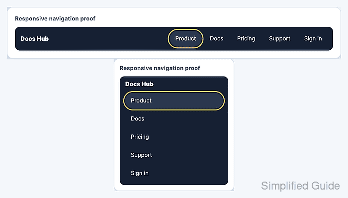
The pattern here uses semantic HTML, flexbox, and one media query. Wide screens keep the links in an inline row that can wrap when labels grow, while narrow screens stack the links into full-width tap targets.
Keep the markup order the same at every size so keyboard and screen reader order match the source. A desktop viewport, a mobile viewport, a keyboard focus pass, and a horizontal overflow check cover the failure modes that usually make a navigation bar feel broken on phones.
Related: How to set responsive CSS breakpoints
Related: How to style keyboard focus with CSS
Tool: CSS Flexbox Generator
Steps to create a responsive CSS navigation bar:
- Add semantic navigation markup with a brand link and a list of page links.
<nav class="site-nav" aria-label="Main navigation">
  <a class="site-nav__brand" href="/">Docs Hub</a>
  <ul class="site-nav__links">
    <li><a href="/product" aria-current="page">Product</a></li>
    <li><a href="/docs">Docs</a></li>
    <li><a href="/pricing">Pricing</a></li>
    <li><a href="/support">Support</a></li>
    <li><a href="/sign-in">Sign in</a></li>
  </ul>
</nav>
The aria-label distinguishes this navigation region when the page has more than one nav element.
- Add the responsive navigation styles to the site stylesheet.
- styles.css
.site-nav,
.site-nav * {
  box-sizing: border-box;
}

.site-nav {
  --nav-bg: #172033;
  --nav-link: #f8fafc;
  --nav-muted: #c6d3e1;
  --nav-hover: #2a3850;
  --nav-focus: #f8c76d;
  display: flex;
  align-items: center;
  justify-content: space-between;
  gap: 1rem;
  padding: 0.75rem 1rem;
  border-radius: 14px;
  background: var(--nav-bg);
  color: var(--nav-link);
}

.site-nav__brand {
  color: var(--nav-link);
  font-size: 1.05rem;
  font-weight: 800;
  text-decoration: none;
  white-space: nowrap;
}

.site-nav__links {
  display: flex;
  flex-wrap: wrap;
  justify-content: flex-end;
  gap: 0.5rem;
  margin: 0;
  padding: 0;
  list-style: none;
}

.site-nav__links a {
  display: block;
  min-height: 44px;
  padding: 0.75rem 1rem;
  border-radius: 999px;
  color: var(--nav-muted);
  line-height: 1.2;
  text-decoration: none;
}

.site-nav__links a:hover,
.site-nav__links a[aria-current="page"] {
  background: var(--nav-hover);
  color: var(--nav-link);
}

.site-nav__brand:focus-visible,
.site-nav__links a:focus-visible {
  outline: 3px solid var(--nav-focus);
  outline-offset: 3px;
}

@media (max-width: 48rem) {
  .site-nav {
    align-items: stretch;
    flex-direction: column;
  }

  .site-nav__links {
    flex-direction: column;
    justify-content: flex-start;
  }

  .site-nav__links a {
    width: 100%;
  }
}
flex-wrap protects the wide layout from long labels before the media query takes over. gap spaces the links and wrapped rows without adding outer margins.
- Open the page at a desktop-width viewport and confirm the link list remains a row.
> getComputedStyle(document.querySelector('.site-nav__links')).flexDirection 'row' - Resize the page below the breakpoint and confirm the link list stacks vertically.
> getComputedStyle(document.querySelector('.site-nav__links')).flexDirection
'column'
Move the 48rem breakpoint when the real navigation labels start crowding earlier or later than the sample content.
Related: How to set responsive CSS breakpoints - Check the narrow viewport for horizontal overflow.
> document.documentElement.scrollWidth === document.documentElement.clientWidth
true
- Tab through the brand and links to confirm the focus ring stays visible on every interactive item.
Keep the focus style visible against both the navigation background and active-link background.
Related: How to style keyboard focus with CSS

Mohd Shakir Zakaria is a cloud architect with deep roots in software development and open-source advocacy. Certified in AWS, Red Hat, VMware, ITIL, and Linux, he specializes in designing and managing robust cloud and on-premises infrastructures.


