How to create a two-column CSS grid layout
Two-column page sections keep related content side by side when the viewport has enough room. They are common for feature blocks, comparison panels, dashboards, forms, and content-plus-sidebar areas where both columns should stay aligned without relying on floats or fixed widths.
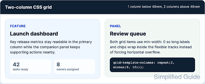
CSS Grid creates the columns with grid-template-columns. A mobile-first rule keeps the section as one column by default, and a width media query changes the same container to two tracks only after the content has enough inline space.
Use flexible tracks such as repeat(2, minmax(0, 1fr)) for equal columns that share the available width. The minmax(0, 1fr) floor and min-width: 0 on direct grid children keep long text, chips, and code-like labels inside the grid instead of forcing a horizontal scrollbar.
Related: How to set responsive CSS breakpoints
Related: How to create an auto-fit CSS grid layout
Related: How to fix CSS horizontal overflow
Steps to create a two-column CSS grid layout:
- Confirm the page uses the responsive viewport meta tag.
<meta name="viewport" content="width=device-width, initial-scale=1">Without this tag, mobile browsers may lay out the page against a wider virtual viewport, so the one-column layout may not match the visible screen width.
- Add the two content blocks inside one grid container.
<section class="feature-grid" aria-label="Product highlights">
  <article class="feature-card">
    <h2>Launch dashboard</h2>
    <p>Key release metrics stay readable in the primary column.</p>
  </article>

  <aside class="feature-panel">
    <h2>Review queue</h2>
    <p>Supporting actions stay aligned in the companion column.</p>
  </aside>
</section>
- Set the default grid to one flexible column.
.feature-grid {
  --layout-gap: 1.25rem;
  display: grid;
  grid-template-columns: minmax(0, 1fr);
  gap: var(--layout-gap);
}

.feature-grid > * {
  min-width: 0;
}
The direct child rule lets each grid item shrink inside its track. Without it, long unbroken content can keep a grid item wider than the viewport.
- Add the two-column layout above the chosen breakpoint.
@media (min-width: 48rem) {
  .feature-grid {
    grid-template-columns: repeat(2, minmax(0, 1fr));
    align-items: start;
    gap: 1.5rem;
  }
}
Choose the breakpoint from the real content width. With a default 16px root size, 48rem is 768px, but the browser evaluates rem breakpoints from the active root font size.
- Check the layout above the breakpoint.
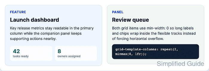
At a 1000px viewport, the verified fixture computed two equal 435px columns with 24px gap and no horizontal overflow.
- Check the layout below the breakpoint.
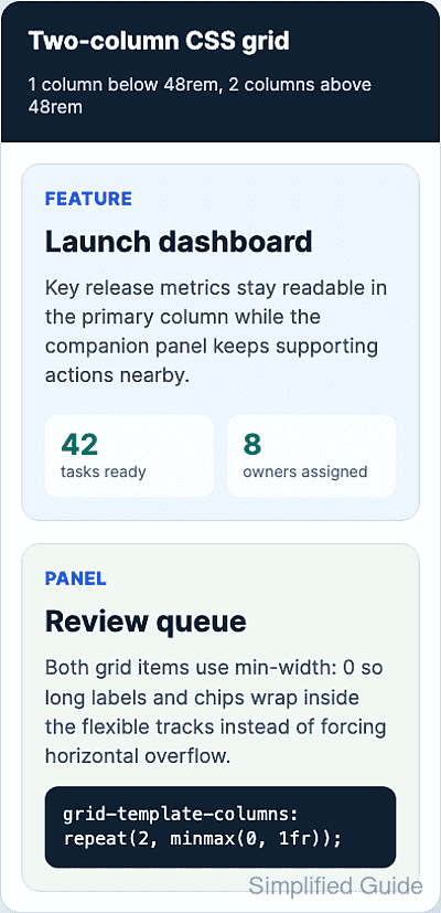
At a 390px viewport, the same fixture computed one 316px column, stacked the second item below the first, and kept horizontal overflow at 0px.
- Verify the active column count in the browser DevTools Console.
const grid = document.querySelector(".feature-grid");
const columns = getComputedStyle(grid).gridTemplateColumns.split(" ").length;
`${columns} columns / overflow ${document.documentElement.scrollWidth - document.documentElement.clientWidth}px`;
"2 columns / overflow 0px"
Resize below the breakpoint and repeat the check. The expected result changes to 1 column / overflow 0px.