How to style keyboard focus with CSS
Keyboard focus styling makes links, buttons, form fields, and custom controls usable when someone navigates a page without a pointer. A visible focus indicator shows where keyboard input or activation will go when the user presses Enter, Space, or starts typing.
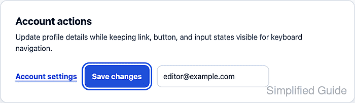
The :focus-visible pseudo-class styles focused elements only when the browser decides the focus indicator should be shown. That usually means keyboard navigation for buttons and links, while text fields may still show focus after a pointer click because the next action is normally typed input.
Use a focus ring that is separate from hover and active states. The ring needs enough contrast against the surrounding surface, enough thickness to be seen quickly, and a forced-colors fallback so high-contrast browser modes can replace the author color with a system color.
Related: How to style an HTML button with CSS
Related: How to style an HTML form with CSS
Steps to style keyboard focus with CSS:
- Add real focusable controls to the page.
<nav class="focus-demo" aria-label="Account actions">
  <a class="focus-link" href="/account">Account settings</a>
  <button class="focus-button" type="button">Save changes</button>
  <input class="focus-field" type="email" value="editor@example.com" aria-label="Email address">
</nav>
A real link, button, or form field already participates in keyboard focus order. Add tabindex only when a custom widget has a documented keyboard pattern and cannot use a native element.
- Define color tokens and shared control styling.
:root {
  --page-bg: #f8fafc;
  --panel-bg: #ffffff;
  --text: #0f172a;
  --border: #cbd5e1;
  --primary: #1d4ed8;
  --primary-hover: #1e40af;
  --focus-ring: #2563eb;
}

.focus-demo {
  display: flex;
  flex-wrap: wrap;
  align-items: center;
  gap: 1rem;
}

.focus-link,
.focus-button,
.focus-field {
  border-radius: 0.65rem;
  font: inherit;
}
- Style the visible controls without removing focus outlines.
.focus-link {
  color: var(--primary);
  font-weight: 700;
  text-decoration-thickness: 0.12em;
  text-underline-offset: 0.2em;
}

.focus-button {
  min-height: 2.75rem;
  border: 0;
  padding: 0.75rem 1rem;
  color: #ffffff;
  background: var(--primary);
  font-weight: 700;
  cursor: pointer;
}

.focus-button:hover {
  background: var(--primary-hover);
}

.focus-field {
  min-height: 2.75rem;
  width: 15rem;
  border: 1px solid var(--border);
  padding: 0.65rem 0.8rem;
  color: var(--text);
  background: #ffffff;
}
A blanket outline: none rule can leave keyboard users with no visible location on the page. Remove the browser outline only when the replacement focus style is already present and visible.
- Add the keyboard-visible focus ring.
:where(.focus-link, .focus-button, .focus-field):focus-visible {
  outline: 3px solid var(--focus-ring);
  outline-offset: 3px;
}
:where() keeps selector specificity low, so a component variant can override the focus color without fighting a heavier selector.
- Add a forced-colors focus color.
@media (forced-colors: active) {
  :where(.focus-link, .focus-button, .focus-field):focus-visible {
    outline-color: Highlight;
  }
}
The Highlight system color lets the browser choose a focus color that fits the active forced-colors palette.
- Press Tab until the button receives keyboard focus.
CSS selector support: true
Keyboard target: focus-button
Keyboard :focus-visible match: true
Keyboard outline: 3px solid rgb(37, 99, 235)
Keyboard outline offset: 3px
The focused control should show the outline outside the button, with a small offset so the ring does not cover the button text or border.
- Click the button and the text field with a pointer.
Pointer click button :focus-visible match: false
Pointer click text input :focus-visible match: true
Buttons and links normally suppress the custom ring after pointer focus. Text inputs can still match :focus-visible after a click because the focused field expects keyboard input.
- Check the focus ring contrast against the surrounding surfaces.
Focus ring contrast against page background: 4.94:1
Focus ring contrast against panel background: 5.17:1
The sample ring exceeds a 3:1 contrast check against both the page background and the white panel. Recheck contrast after changing the focus color, page background, component fill, or outline offset.