How to support system dark mode with CSS
Operating systems let people choose a light or dark appearance, and browsers expose that choice through the prefers-color-scheme media feature. Matching the page colors to that preference keeps text, panels, links, and controls from looking out of place when the rest of the device is already dark.
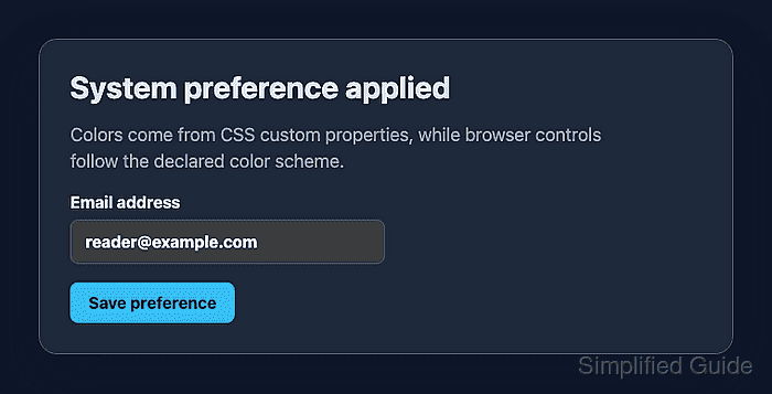
Use prefers-color-scheme for authored colors and color-scheme for browser-provided parts such as form controls, scrollbars, and default surfaces. CSS custom properties keep the light and dark palettes in one place so components can read the same token names in both modes.
Keep light mode as the fallback, switch the same tokens when the browser reports a dark preference, and test both branches with browser color-scheme emulation. A manual theme toggle can still override these tokens later, but the system preference should work before application state is added.
Steps to support system dark mode with CSS:
- Add a color-scheme meta tag to the document head.
<meta name="color-scheme" content="light dark">The meta tag tells the browser that both schemes are supported before the stylesheet finishes loading.
- Define the light theme tokens and default color-scheme on :root.
- styles.css
:root {
  color-scheme: light;
  --color-page: #f8fafc;
  --color-surface: #ffffff;
  --color-text: #111827;
  --color-muted: #4b5563;
  --color-border: #cbd5e1;
  --color-accent: #2563eb;
}
- Override the same tokens inside the dark preference media query.
- styles.css
@media (prefers-color-scheme: dark) {
  :root {
    color-scheme: dark;
    --color-page: #0f172a;
    --color-surface: #1e293b;
    --color-text: #e2e8f0;
    --color-muted: #94a3b8;
    --color-border: #475569;
    --color-accent: #38bdf8;
  }
}
Keep the custom-property names identical in both branches. Components should not need separate light and dark selectors just to read the palette.
- Apply the tokens to page and component styles.
- styles.css
body {
  margin: 0;
  background: var(--color-page);
  color: var(--color-text);
}

.card {
  background: var(--color-surface);
  border: 1px solid var(--color-border);
  color: var(--color-text);
}

.card p {
  color: var(--color-muted);
}

input {
  color: inherit;
  border: 1px solid var(--color-border);
}

button {
  background: var(--color-accent);
  color: var(--color-page);
}
Leave native controls without hard-coded light backgrounds unless the design system supplies matching dark values. The color-scheme declaration lets the browser choose matching default control colors.
- Open the page with a light system preference.
If the operating system already uses dark appearance, use browser emulation to set prefers-color-scheme to light for this check.
- Check the light branch in the browser console.
matchMedia("(prefers-color-scheme: dark)").matches
false
getComputedStyle(document.documentElement).colorScheme
"light"
getComputedStyle(document.body).backgroundColor
"rgb(248, 250, 252)"
- Emulate a dark system preference in the browser.
Chrome and Edge expose this in the Rendering panel as Emulate CSS media feature prefers-color-scheme. Changing the operating-system appearance to dark should produce the same CSS branch.
- Check the dark branch in the browser console.
matchMedia("(prefers-color-scheme: dark)").matches
true
getComputedStyle(document.documentElement).colorScheme
"dark"
getComputedStyle(document.body).backgroundColor
"rgb(15, 23, 42)"
- Check a native form control after dark emulation.
getComputedStyle(document.querySelector("input")).backgroundColor
"rgb(59, 59, 59)"
Native form-control colors vary by browser. The control should switch to a dark surface after color-scheme changes to dark, rather than staying as a light control on the dark page.