Scatter plots reveal clusters, outliers, and relationships between paired measurements without implying a continuous sequence between points. Matplotlib can also encode another measurement through marker color or area, which makes a single chart useful for comparing several numeric dimensions.
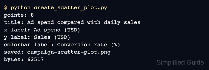
The object-oriented interface keeps each chart element attached to a specific Axes. ax.scatter() receives the x and y positions, while c maps scalar values through a colormap and s sets marker area in points squared.
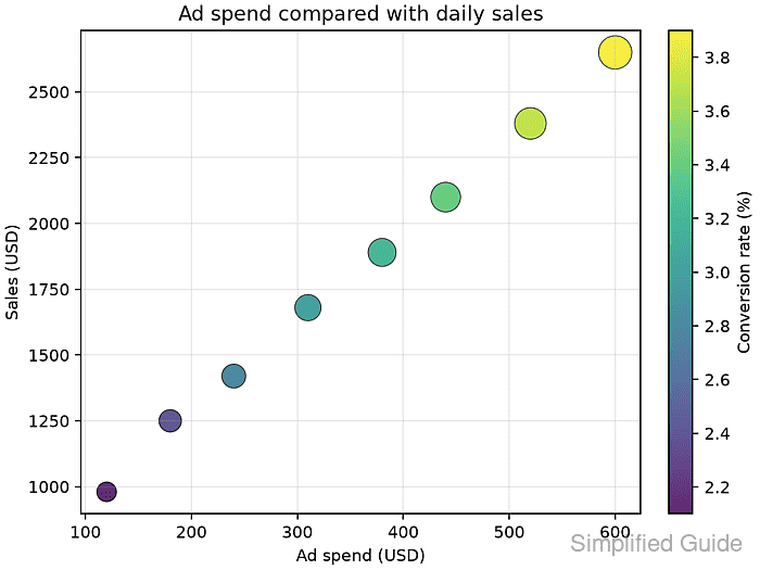
Every per-point sequence must describe the same number of observations. The finished image should show all eight sample records, labeled axes, and a colorbar whose range matches the conversion-rate values.
Related: How to create a line chart in Matplotlib
Related: How to add a legend in Matplotlib
Related: How to add a colorbar in Matplotlib
Steps to create a Matplotlib scatter plot:
- Create create_scatter_plot.py with the imports, paired data series, and equal-length input check.
- create_scatter_plot.py
from pathlib import Path

import matplotlib.pyplot as plt

ad_spend = [120, 180, 240, 310, 380, 440, 520, 600]
sales = [980, 1250, 1420, 1680, 1890, 2100, 2380, 2650]
conversion_rate = [2.1, 2.4, 2.8, 3.0, 3.2, 3.4, 3.7, 3.9]
orders = [24, 31, 35, 42, 48, 54, 61, 68]

if len({len(ad_spend), len(sales), len(conversion_rate), len(orders)}) != 1:
    raise ValueError("Each data series must contain one value per point")

marker_size = [order * 6 for order in orders]
output = Path("campaign-scatter-plot.png")
The four lists represent the same observations and therefore require equal lengths. The x, y, color, and marker-size inputs need one value for every plotted point.
- Append the figure and scatter-marker construction after the output assignment.
fig, ax = plt.subplots(figsize=(6.4, 4.8), layout="constrained")
scatter = ax.scatter(
    ad_spend,
    sales,
    c=conversion_rate,
    s=marker_size,
    cmap="viridis",
    alpha=0.85,
    edgecolors="black",
    linewidths=0.5,
)
c maps conversion rates through viridis. s receives marker areas, so multiplying the order counts keeps their relative sizes while making each point readable.
- Append the plot presentation block after the ax.scatter() call.
fig.colorbar(scatter, ax=ax, label="Conversion rate (%)")
ax.set_title("Ad spend compared with daily sales")
ax.set_xlabel("Ad spend (USD)")
ax.set_ylabel("Sales (USD)")
ax.grid(True, alpha=0.25)
- Finish the script with its export block.
fig.savefig(output, dpi=160)
plt.close(fig)

print(f"points: {len(ad_spend)}")
print(f"saved: {output}")
print(f"bytes: {output.stat().st_size}")
- Run create_scatter_plot.py in the Python environment that has Matplotlib installed.
$ python create_scatter_plot.py
points: 8
saved: campaign-scatter-plot.png
bytes: 65022
The byte count can vary with the Matplotlib version, fonts, and rendering backend. A run that raises the equal-length ValueError needs aligned input series before it can create the plot.
- Inspect campaign-scatter-plot.png for eight markers, labeled axes, and a colorbar spanning the conversion-rate values.

Mohd Shakir Zakaria is a cloud architect with deep roots in software development and open-source advocacy. Certified in AWS, Red Hat, VMware, ITIL, and Linux, he specializes in designing and managing robust cloud and on-premises infrastructures.


