Modal dialogs interrupt the page so a user can complete a short decision without losing their place. Start with the native HTML <dialog> element, open it with showModal(), and add only the behavior the page needs around that built-in modal state.
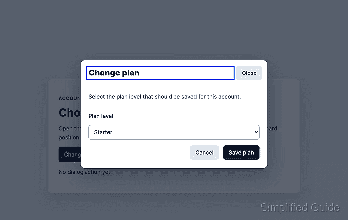
The native modal dialog keeps the rest of the page unavailable while it is open, limits keyboard focus to the dialog, and supports Escape as a close request in modern browsers. JavaScript still needs to remember the invoking control, move initial focus to a useful element, handle pointer dismissal when the design allows it, and report or process the result after the dialog closes.
Native dialog modals fit small in-page tasks such as confirming a setting, editing a short form, or collecting one focused choice. Keep a visible close or cancel button inside the dialog, and test the mouse path and keyboard path before treating the modal as accessible.
Related: Use the HTML dialog element
Related: Add event listeners in JavaScript
Steps to open and close an accessible JavaScript modal:
- Add a trigger button and a status message to the page.
- index.html
<button type="button" id="open-plan-dialog" data-open-modal>
  Change plan
</button>

<p id="modal-status" role="status" data-modal-status>
  No dialog action yet.
</p>
The trigger must be a real button so mouse, touch, Enter, and Space activation reach the same JavaScript listener.
- Add the modal dialog markup after the main page content.
- index.html
<dialog
  class="modal"
  id="plan-dialog"
  aria-labelledby="plan-dialog-title"
  aria-describedby="plan-dialog-description"
  data-modal
>
  <form method="dialog" class="modal__panel">
    <h2 id="plan-dialog-title" tabindex="-1" data-modal-title>
      Change plan
    </h2>

    <p id="plan-dialog-description">
      Select the plan level that should be saved for this account.
    </p>

    <label for="plan-level">Plan level</label>
    <select id="plan-level" name="plan-level">
      <option>Starter</option>
      <option>Team</option>
      <option>Business</option>
    </select>

    <div class="modal__actions">
      <button id="cancel-plan-dialog" type="submit" value="cancel">
        Cancel
      </button>
      <button id="save-plan-dialog" type="submit" value="save">
        Save plan
      </button>
    </div>

    <button
      class="modal__close"
      id="close-plan-dialog"
      type="submit"
      value="cancel"
    >
      Close
    </button>
  </form>
</dialog>
The method="dialog" form lets the dialog buttons close the modal and set dialog.returnValue without a custom submit handler.
- Add visible modal, backdrop, and focus styles.
- styles.css
.modal {
  border: 0;
  border-radius: 0.75rem;
  box-shadow: 0 1.25rem 3rem rgb(15 23 42 / 0.35);
  max-inline-size: 34rem;
  padding: 0;
}

.modal::backdrop {
  background: rgb(15 23 42 / 0.68);
}

.modal__panel {
  display: grid;
  gap: 1rem;
  padding: 1.5rem;
  position: relative;
}

.modal__close {
  position: absolute;
  inset-block-start: 1rem;
  inset-inline-end: 1rem;
}

.modal h2 {
  margin-inline-end: 5rem;
}

.modal__actions {
  display: flex;
  gap: 0.75rem;
  justify-content: end;
}

:focus-visible {
  outline: 3px solid #2563eb;
  outline-offset: 3px;
}

.modal h2:focus {
  outline: 3px solid #2563eb;
  outline-offset: 0.35rem;
}
A visible ::backdrop supports the modal state visually while showModal() blocks interaction outside the dialog.
- Select the dialog controls in JavaScript.
- modal.js
const dialog = document.querySelector("[data-modal]");
const openButton = document.querySelector("[data-open-modal]");
const title = dialog.querySelector("[data-modal-title]");
const status = document.querySelector("[data-modal-status]");

let lastFocusedElement = null;
- Open the dialog with showModal() and focus the dialog title.
- modal.js
openButton.addEventListener("click", () => {
  if (dialog.open) {
    return;
  }

  lastFocusedElement = document.activeElement;
  dialog.returnValue = "";
  dialog.showModal();
  title.focus({ preventScroll: true });
});
Focusing the title gives keyboard and screen reader users a stable starting point. Move focus to the first form control instead when the dialog is only a short data-entry form and the title is already clear from context.
- Close the dialog from backdrop pointer clicks and restore focus after every close path.
- modal.js
dialog.addEventListener("pointerdown", (event) => {
  if (event.target !== dialog) {
    return;
  }

  const dialogBox = dialog.getBoundingClientRect();
  const clickedInDialog =
    event.clientX >= dialogBox.left &&
    event.clientX <= dialogBox.right &&
    event.clientY >= dialogBox.top &&
    event.clientY <= dialogBox.bottom;

  if (!clickedInDialog) {
    dialog.close("dismiss");
  }
});

dialog.addEventListener("close", () => {
  const result = dialog.returnValue || "dismiss";
  status.textContent = `Dialog closed with: ${result}`;

  if (lastFocusedElement instanceof HTMLElement) {
    lastFocusedElement.focus({ preventScroll: true });
  }
});
The close event runs after Escape, method="dialog" buttons, and the backdrop pointer handler above, so one focus-restoration path covers all close actions.
- Verify the modal behavior in a browser. Activate Change plan, confirm focus moves to the Change plan heading inside the dialog, press Tab until focus cycles through dialog controls without reaching the page behind it, and press Escape.
Dialog open: true
Focus after open: plan-dialog-title
Tab sequence inside dialog: plan-level, cancel-plan-dialog, save-plan-dialog, close-plan-dialog
Focus stayed inside dialog after Tab: true
Dialog open after Escape: false
Focus after Escape: open-plan-dialog
- Reopen the dialog and activate Save plan.
Dialog closed with: save
The status message proves the close button value reached dialog.returnValue, while the returned focus on Change plan proves the page is ready for the next keyboard action.

Mohd Shakir Zakaria is a cloud architect with deep roots in software development and open-source advocacy. Certified in AWS, Red Hat, VMware, ITIL, and Linux, he specializes in designing and managing robust cloud and on-premises infrastructures.


