A CSS transition gives an interactive state a short visual change without a separate keyframe animation. It fits hover, focus, selected, and expanded states where one property should move from the base value to a new value when the selector starts matching.
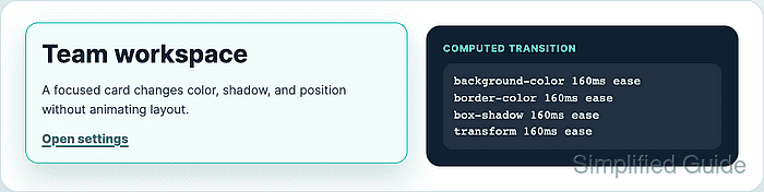
The transition shorthand belongs on the base rule, not only on the hover or state rule, so the browser can animate both entering and leaving the state. List only the properties that should animate, and prefer opacity, transform, background-color, border-color, or box-shadow over layout properties that can reflow surrounding content.
The sample card keeps its default state usable, adds a reusable .is-raised state for testing, and uses the same transitioned properties for :hover and :focus-within. A reduced-motion branch removes movement while keeping color, border, and shadow feedback visible.
Related: How to add a CSS animation
Related: How to respect reduced motion with CSS
Related: How to style keyboard focus with CSS
Steps to add a CSS transition:
- Add the element that needs an animated state.
<article class="transition-card">
  <h2>Team workspace</h2>
  <p>A focused card changes color, shadow, and position without animating layout.</p>
  <a class="transition-card__link" href="/settings">Open settings</a>
</article>
The link lets :focus-within match when keyboard focus moves inside the card. Use a real link, button, or form control instead of making a non-interactive element focusable only for styling.
- Set the base visual state before adding motion.
- styles.css
.transition-card {
  display: grid;
  gap: 0.875rem;
  max-width: 30rem;
  padding: 1.25rem;
  border: 1px solid #cbd5e1;
  border-radius: 1rem;
  color: #172033;
  background: #ffffff;
  box-shadow: 0 4px 12px rgb(15 23 42 / 8%);
  transform: translateY(0);
}

.transition-card__link {
  width: fit-content;
  border-radius: 0.55rem;
  color: #0f766e;
  font-weight: 800;
  text-decoration-thickness: 0.12em;
  text-underline-offset: 0.2em;
}
The base rule holds the resting values. The transitioned state can then change from known starting values instead of inheriting browser defaults or earlier component styles.
- Add the transition to the base rule.
- styles.css
.transition-card {
  transition:
    background-color 160ms ease,
    border-color 160ms ease,
    box-shadow 160ms ease,
    transform 160ms ease;
}
Avoid transition: all because future edits can accidentally animate size, layout, or expensive paint properties.
- Add the hover, focus, and test state rules.
- styles.css
.transition-card:hover,
.transition-card:focus-within,
.transition-card.is-raised {
  border-color: #14b8a6;
  background: #f0fdfa;
  box-shadow: 0 18px 38px rgb(15 118 110 / 22%);
  transform: translateY(-4px);
}

.transition-card__link:focus-visible {
  outline: 3px solid #f59e0b;
  outline-offset: 4px;
}
The .is-raised class gives JavaScript or browser-console tests the same final state as hover and focus. Keep the keyboard focus outline separate from the transition so focus remains visible even when motion is reduced.
Related: How to style keyboard focus with CSS
- Disable movement for reduced-motion users.
- styles.css
@media (prefers-reduced-motion: reduce) {
  .transition-card {
    transition: none;
  }

  .transition-card:hover,
  .transition-card:focus-within,
  .transition-card.is-raised {
    transform: none;
  }
}
The color, border, and shadow state still appears instantly. Removing transform avoids the vertical movement while preserving a visible state change.
- Load the page and check the configured transition in the browser console.
CSS.supports("transition: transform 160ms ease")
true
getComputedStyle(document.querySelector(".transition-card")).transitionProperty
"background-color, border-color, box-shadow, transform"
getComputedStyle(document.querySelector(".transition-card")).transitionDuration
"0.16s, 0.16s, 0.16s, 0.16s"
- Toggle the test state and check the final transform.
document.querySelector(".transition-card").classList.add("is-raised")
undefined
getComputedStyle(document.querySelector(".transition-card")).transform
"matrix(1, 0, 0, 1, 0, -4)"
The exact matrix format is browser output for translateY(-4px). A value of none here means the state rule did not apply or reduced motion is already active.
- Emulate reduced motion and confirm the movement is removed.
matchMedia("(prefers-reduced-motion: reduce)").matches
true
getComputedStyle(document.querySelector(".transition-card")).transitionDuration
"0s"
getComputedStyle(document.querySelector(".transition-card")).transform
"none"
In Chromium DevTools, use Rendering → Emulate CSS media feature prefers-reduced-motion → reduce.

Mohd Shakir Zakaria is a cloud architect with deep roots in software development and open-source advocacy. Certified in AWS, Red Hat, VMware, ITIL, and Linux, he specializes in designing and managing robust cloud and on-premises infrastructures.


