Scroll-linked interface effects often start as JavaScript listeners that update styles on every scroll event. CSS scroll-driven animations move that timing into the browser animation system, so a keyframe can follow the root page scroll or an element's position inside a scrollport.
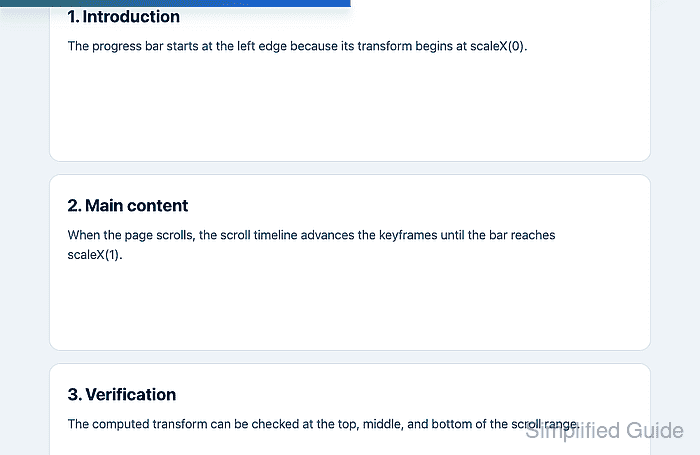
The animation-timeline property changes an animation from a time-based sequence into a scroll or view progress sequence. A page progress indicator is a narrow use case because the animated element only needs to scale from empty to full as the root scroll range advances.
Browser support is still limited in some engines, so keep the effect inside a @supports branch and make the page complete without the animation. Reduced-motion users should receive a non-moving state instead of a scroll-linked moving indicator.
Related: How to add a CSS animation
Related: How to respect reduced motion with CSS
Steps to create a scroll-driven CSS progress animation:
- Add a decorative progress element near the start of the page body.
<div class="scroll-progress" aria-hidden="true"></div>

<main class="article">
  <h1>Release notes</h1>
  <p>Content continues far enough for the page to scroll.</p>
</main>
Keep the indicator decorative unless it carries information that is not available elsewhere. A scroll progress bar usually should not be announced by screen readers.
- Set the fallback progress-bar style before adding the animation.
- styles.css
.scroll-progress {
  display: none;
  position: fixed;
  inset: 0 0 auto;
  height: 0.35rem;
  transform: scaleX(0);
  transform-origin: left center;
  background: linear-gradient(90deg, #0f766e, #2563eb);
  z-index: 1000;
}
Unsupported browsers keep the page content and skip the progress bar because display: block is added only in the support query.
- Define the keyframes that fill the progress bar.
- styles.css
@keyframes page-scroll-progress {
  to {
    transform: scaleX(1);
  }
}
The base rule starts at scaleX(0), so the keyframes only need the final scaleX(1) state.
- Attach the animation inside an @supports branch for the root block scroll timeline.
- styles.css
@supports (animation-timeline: scroll(root block)) {
  .scroll-progress {
    display: block;
    animation-name: page-scroll-progress;
    animation-duration: 1ms;
    animation-timing-function: linear;
    animation-fill-mode: both;
    animation-timeline: scroll(root block);
  }
}
The nonzero animation-duration keeps the keyframe animation active, while scroll(root block) maps progress to the page's root block-axis scroll range. If an animation shorthand is used later, set animation-timeline after that shorthand because the shorthand resets it to auto.
- Add a reduced-motion override after the scroll timeline rule.
- styles.css
@media (prefers-reduced-motion: reduce) {
  .scroll-progress {
    animation: none;
    transform: scaleX(1);
  }
}
This keeps a static accent bar. Use display: none in the reduced-motion branch when the indicator should disappear entirely.
- Load the page in a browser and confirm the scroll timeline is active.
> CSS.supports("animation-timeline: scroll(root block)")
true
> getComputedStyle(document.querySelector(".scroll-progress")).animationName
"page-scroll-progress"
> getComputedStyle(document.querySelector(".scroll-progress")).animationTimeline
"scroll(root)"
- Scroll to the middle of the page and check the progress transform.
> (() => {
  const bar = document.querySelector(".scroll-progress");
  const matrix = new DOMMatrixReadOnly(getComputedStyle(bar).transform);

  return {
    scrollTop: Math.round(document.scrollingElement.scrollTop),
    maxScroll: document.scrollingElement.scrollHeight - innerHeight,
    scaleX: Number(matrix.a.toFixed(2))
  };
})()
{scrollTop: 422, maxScroll: 843, scaleX: 0.5}
The exact scrollTop and maxScroll values depend on page length. The scaleX value should be near 0.5 at the middle of the scroll range and near 1 at the bottom.
- Emulate reduced motion and confirm the animation stops.
> matchMedia("(prefers-reduced-motion: reduce)").matches
true
> getComputedStyle(document.querySelector(".scroll-progress")).animationName
"none"
> new DOMMatrixReadOnly(getComputedStyle(document.querySelector(".scroll-progress")).transform).a
1
In Chromium DevTools, use Rendering → Emulate CSS media feature prefers-reduced-motion → reduce.

Mohd Shakir Zakaria is a cloud architect with deep roots in software development and open-source advocacy. Certified in AWS, Red Hat, VMware, ITIL, and Linux, he specializes in designing and managing robust cloud and on-premises infrastructures.


