How to plot an ROC curve with scikit-learn
A binary classifier can rank positive examples well even when one decision threshold produces a poor mix of false alarms and missed cases. An ROC curve exposes that ranking behavior by tracing the true positive rate against the false positive rate across score thresholds.
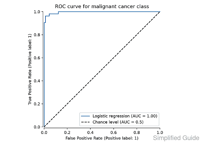
The RocCurveDisplay.from_estimator() method accepts a fitted classifier or classifier Pipeline together with held-out features and labels. Its default response_method=“auto” tries predict_proba() first and otherwise uses decision_function(), while pos_label=1 makes the evaluated class explicit.
The breast cancer dataset records malignant cases as class 0, so the script converts malignant rows to label 1 before fitting. A stratified test split keeps both classes represented, and the saved plot remains separate from the rows used to train the classifier.
Steps to plot a scikit-learn ROC curve:
- Create plot_roc_curve.py with the imports, positive-label conversion, and stratified train-test split.
- plot_roc_curve.py
from pathlib import Path

import matplotlib

matplotlib.use("Agg")

import matplotlib.pyplot as plt
from sklearn.datasets import load_breast_cancer
from sklearn.linear_model import LogisticRegression
from sklearn.metrics import RocCurveDisplay
from sklearn.model_selection import train_test_split
from sklearn.pipeline import make_pipeline
from sklearn.preprocessing import StandardScaler


cancer = load_breast_cancer()
X = cancer.data
y = (cancer.target == 0).astype(int)

X_train, X_test, y_train, y_test = train_test_split(
    X,
    y,
    test_size=0.25,
    stratify=y,
    random_state=42,
)
The target conversion assigns 1 to malignant cases, matching the pos_label used when the ROC curve is calculated.
- Append the standardized logistic-regression pipeline after the train_test_split(…) block.
model = make_pipeline(
    StandardScaler(),
    LogisticRegression(max_iter=1000),
)
model.fit(X_train, y_train)
- Append the ROC display block below model.fit(…) with roc-curve-plot.png as the output path.
display = RocCurveDisplay.from_estimator(
    model,
    X_test,
    y_test,
    name="Logistic regression",
    pos_label=1,
    plot_chance_level=True,
    despine=True,
)
display.ax_.set_title("ROC curve for malignant cancer class")
display.figure_.set_size_inches(7, 5)
display.figure_.tight_layout()
display.figure_.savefig("roc-curve-plot.png", dpi=160)
plt.close(display.figure_)
from_estimator() calculates the false-positive and true-positive rates from the held-out labels and the fitted pipeline's scores. The dashed diagonal is the chance-level reference.
- Append the run summary below plt.close(…).
plot_path = Path("roc-curve-plot.png")
print(f"train rows: {X_train.shape[0]}")
print(f"test rows: {X_test.shape[0]}")
print("positive class: malignant")
print(f"roc auc: {display.roc_auc:.3f}")
print(f"curve points: {len(display.fpr)}")
print(f"plot saved: {plot_path.name}")
- Run plot_roc_curve.py to write the held-out ROC curve to roc-curve-plot.png.
$ python3 plot_roc_curve.py
train rows: 426
test rows: 143
positive class: malignant
roc auc: 0.996
curve points: 10
plot saved: roc-curve-plot.png
An AUC near 1.0 means the model ranks most malignant cases above benign cases on this split. It does not choose a deployment threshold or describe the cost of false positives and false negatives.
- Load roc-curve-plot.png with Matplotlib to confirm the saved image dimensions.
$ python3 -c "from matplotlib.image import imread; print(imread('roc-curve-plot.png').shape)"
(800, 1120, 4)
The tuple reports 800 rows, 1120 columns, and four RGBA channels. A missing, empty, or unreadable PNG makes imread() fail instead of printing this shape.