How to plot a confusion matrix with scikit-learn
A confusion matrix turns held-out classification predictions into a class-by-class count table. In scikit-learn, plotting those counts exposes which labels a classifier confuses instead of reducing its behavior to one accuracy score.
The from_predictions() constructor on ConfusionMatrixDisplay accepts true and predicted labels, computes the matrix, and draws it on a Matplotlib axis. An explicit labels sequence fixes the row and column order, while display_labels replaces numeric targets with names on the plot.
Rows represent true labels and columns represent predicted labels. Diagonal cells count correct classifications; off-diagonal cells identify the class pairs that need closer review.
Steps to plot a scikit-learn confusion matrix:
- Create confusion_matrix_plot_demo.py with the plotting imports and noninteractive Matplotlib backend.
- confusion_matrix_plot_demo.py
from pathlib import Path

import matplotlib

matplotlib.use("Agg")

import matplotlib.pyplot as plt
import sklearn
from sklearn.datasets import load_wine
from sklearn.metrics import ConfusionMatrixDisplay
from sklearn.model_selection import train_test_split
from sklearn.tree import DecisionTreeClassifier
matplotlib.use(“Agg”) allows the script to save a plot from a shell, container, or job runner without a graphical display.
- Add the stratified training and test split below the import block.
wine = load_wine()
X_train, X_test, y_train, y_test = train_test_split(
    wine.data,
    wine.target,
    test_size=0.30,
    stratify=wine.target,
    random_state=7,
)
- Add the fitted decision tree and held-out predictions below the data-split block.
model = DecisionTreeClassifier(max_depth=3, random_state=7)
model.fit(X_train, y_train)
y_pred = model.predict(X_test)
- Add the confusion-matrix display below the prediction block.
fig, ax = plt.subplots(figsize=(6, 5))
display = ConfusionMatrixDisplay.from_predictions(
    y_test,
    y_pred,
    labels=range(len(wine.target_names)),
    display_labels=wine.target_names,
    values_format="d",
    cmap="Blues",
    colorbar=False,
    ax=ax,
)
ax.set_title("Wine classifier confusion matrix")
fig.tight_layout()
The explicit numeric labels order matches wine.target_names, so each display name stays attached to the correct matrix row and column.
- Add the PNG save and console summary below the display block.
output_path = Path("confusion-matrix-display.png")
fig.savefig(output_path, dpi=160, bbox_inches="tight")

print(f"scikit-learn {sklearn.__version__}")
print("labels: " + ", ".join(wine.target_names))
print("confusion matrix:")
print(display.confusion_matrix)
print(f"saved plot: {output_path}")
- Run the completed plotting script from its directory.
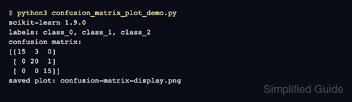
$ python3 confusion_matrix_plot_demo.py
scikit-learn 1.9.0
labels: class_0, class_1, class_2
confusion matrix:
[[15  3  0]
 [ 0 20  1]
 [ 0  0 15]]
saved plot: confusion-matrix-display.png
- Open the saved confusion-matrix-display.png file.
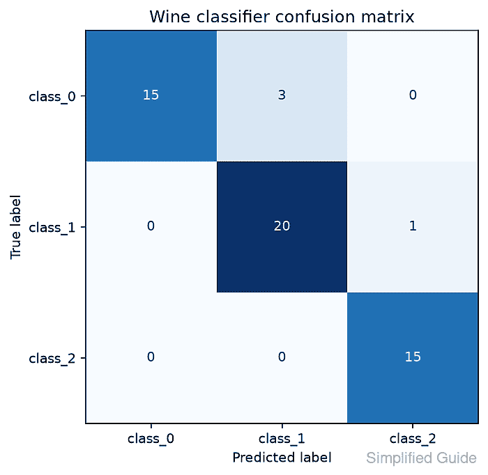
- Confirm that the plot shows true labels on rows, predicted labels on columns, and the same cell counts as the console matrix.