How to set a colormap in Matplotlib
Scalar plots use color to show where each value falls on a numeric scale. In Matplotlib, an image, contour set, or colored scatter plot carries its own colormap, so the selected map controls how that plotted data becomes visible colors.
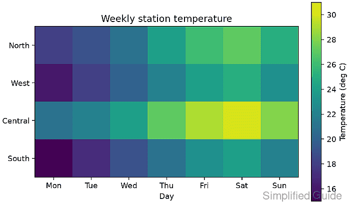
The matplotlib.colormaps registry provides built-in maps by name. Passing one of those registered maps through cmap applies it to two-dimensional scalar data, while vmin and vmax keep the scale fixed when plots need comparable color limits.
A weekly temperature matrix has an ordered low-to-high scale, so viridis fits the data. Values centered around a meaningful midpoint need a diverging map instead, while fixed line or marker colors belong to a separate plot-color setting.
Related: How to set plot colors in Matplotlib
Related: How to create a heatmap in Matplotlib
Steps to set a Matplotlib colormap:
- Choose a colormap category for the values being plotted.
Sequential maps such as viridis fit ordered measurements, diverging maps such as RdBu fit values around a critical midpoint, and cyclic maps such as twilight fit values that wrap at the endpoints.
- Create colormap_set.py with the imports and temperature matrix.
- colormap_set.py
import matplotlib.pyplot as plt
import numpy as np
from matplotlib import colormaps

temperatures = np.array(
    [
        [18, 19, 21, 24, 26, 27, 25],
        [16, 18, 20, 22, 24, 25, 23],
        [21, 22, 24, 27, 29, 30, 28],
        [15, 17, 19, 21, 23, 24, 22],
    ]
)
- Append the labels, registered colormap, and scalar image construction to colormap_set.py.
stations = ["North", "West", "Central", "South"]
days = ["Mon", "Tue", "Wed", "Thu", "Fri", "Sat", "Sun"]
cmap = colormaps["viridis"]

fig, ax = plt.subplots(figsize=(6.4, 3.8), layout="constrained")
image = ax.imshow(temperatures, cmap=cmap, vmin=15, vmax=31)
The cmap argument accepts either a registered name or a Colormap object. Explicit limits keep the same value-to-color mapping when the matrix minimum or maximum changes.
- Append the axes labels and colorbar to colormap_set.py.
ax.set_xticks(range(len(days)), days)
ax.set_yticks(range(len(stations)), stations)
ax.set_xlabel("Day")
ax.set_title("Weekly station temperature")
fig.colorbar(image, ax=ax, label="Temperature (deg C)")
Related: How to add a colorbar in Matplotlib
- Append the PNG export and active-colormap report to colormap_set.py.
fig.savefig("colormap-set.png", dpi=160)
print(f"active colormap: {image.get_cmap().name}")
print("saved: colormap-set.png")
- Run colormap_set.py from the directory that should receive the PNG.
$ python colormap_set.py
active colormap: viridis
saved: colormap-set.png
- Verify colormap-set.png shows the low-to-high viridis scale aligned with the labeled colorbar.
The darkest cells represent the lowest temperatures, the brightest cell represents 30 degrees C, and the colorbar keeps the displayed scale fixed from 15 to 31.