How to create a custom element with JavaScript
Custom elements let a browser upgrade a hyphenated HTML tag into a JavaScript-backed component. They fit small reusable interface pieces that should work in plain HTML, especially when the behavior needs to travel without a framework-specific runtime.
An autonomous custom element extends HTMLElement and is registered with customElements.define(). The custom tag name must start with a lowercase letter, contain a hyphen, and avoid uppercase characters, so names such as status-badge work while plain names such as badge do not.
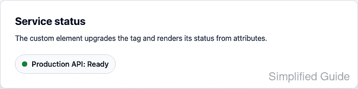
A small <status-badge> tag reads label and status attributes, renders its own shadow DOM, and updates when the status attribute changes. Keeping setup in connectedCallback() and rendering from observedAttributes lets static markup upgrade after parsing while later attribute changes redraw the component.
Steps to create a custom element with JavaScript:
- Add the custom tag to the HTML page and load the component script with defer.
<section class="service-panel">
  <h2>Service status</h2>
  <status-badge label="Production API" status="ready"></status-badge>
</section>

<script src="status-badge.js" defer></script>
Use a hyphenated name for custom tags. The browser treats <status-badge> as an autonomous custom element after registration.
Related: How to load JavaScript with defer - Hide the tag until the browser has loaded and registered it.
status-badge:not(:defined) {
  visibility: hidden;
}
The :defined pseudo-class matches built-in elements and custom elements that already have a registered definition.
- Create status-badge.js with the custom element class and registration.
const STATUS_LABELS = {
  ready: "Ready",
  busy: "Busy",
  offline: "Offline",
};

class StatusBadge extends HTMLElement {
  static observedAttributes = ["label", "status"];

  constructor() {
    super();
    this.attachShadow({ mode: "open" });
  }

  connectedCallback() {
    if (!this.hasAttribute("role")) {
      this.setAttribute("role", "status");
    }

    this.render();
  }

  attributeChangedCallback() {
    this.render();
  }

  render() {
    const label = this.getAttribute("label") || "Service";
    const status = this.getAttribute("status") || "offline";
    const normalizedStatus = Object.prototype.hasOwnProperty.call(
      STATUS_LABELS,
      status,
    )
      ? status
      : "offline";

    this.shadowRoot.innerHTML = `
      <style>
        :host {
          display: inline-block;
          font: 600 1rem system-ui, sans-serif;
        }

        .badge {
          display: inline-flex;
          align-items: center;
          gap: 0.55rem;
          padding: 0.7rem 0.9rem;
          border-radius: 999px;
          background: #f8fafc;
          color: #1f2937;
          border: 1px solid #d8dee8;
        }

        .badge__dot {
          width: 0.75rem;
          height: 0.75rem;
          border-radius: 999px;
          background: #64748b;
        }

        .badge--ready .badge__dot {
          background: #138a43;
        }

        .badge--busy .badge__dot {
          background: #c77700;
        }

        .badge--offline .badge__dot {
          background: #9b1c31;
        }
      </style>
      <span class="badge badge--${normalizedStatus}">
        <span class="badge__dot" aria-hidden="true"></span>
        <span class="badge__text"></span>
      </span>
    `;

    this.shadowRoot.querySelector(".badge__text").textContent =
      `${label}: ${STATUS_LABELS[normalizedStatus]}`;
  }
}

customElements.define("status-badge", StatusBadge);
Call super() before using this in the constructor. Keep attribute reads and rendering in lifecycle callbacks so parsed attributes and page markup are available.
- Open the page in a browser.
- Select the upgraded tag in the browser console.
> const badge = document.querySelector("status-badge") undefined - Confirm the browser registry contains the custom element.
> customElements.get("status-badge").name "StatusBadge" - Confirm the existing tag has upgraded.
> badge.matches(":defined") true - Read the rendered shadow DOM text.
> badge.shadowRoot.querySelector(".badge__text").textContent "Production API: Ready" - Change the status attribute from the browser console.
> badge.setAttribute("status", "busy") undefined - Confirm the attribute change rerendered the custom element.
> badge.shadowRoot.querySelector(".badge__text").textContent
"Production API: Busy"