How to create CSS print styles
Printed web pages expose layout choices that the screen can hide with navigation, shadows, sticky controls, and wide backgrounds. CSS print styles turn the same document into a paper or PDF copy by removing screen-only interface, setting page margins, and keeping the content readable after pagination.
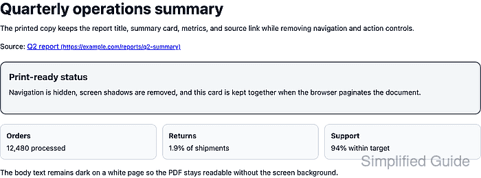
Use @media print for rules that apply only when the browser prints or exports the page. Use @page for page-level defaults such as paper size and margins, then keep the document content inside normal selectors so screen styles and print styles can share the same markup.
Browser print dialogs can still override paper size, margins, headers, footers, and background graphics. Treat the stylesheet as the page's default print handoff, then verify the actual print preview or saved PDF in the browser that readers use.
Related: How to set responsive CSS breakpoints
Related: How to fix CSS horizontal overflow
Steps to create CSS print styles:
- Add printable document markup and mark screen-only controls.
<header class="site-header print-hidden">
  <strong>Dashboard</strong>
  <nav aria-label="Screen navigation">
    <a href="/">Home</a>
    <a href="/reports">Reports</a>
    <a href="/settings">Settings</a>
  </nav>
</header>

<div class="toolbar print-hidden" aria-label="Report actions">
  <button type="button">Share</button>
  <button type="button">Export CSV</button>
</div>

<main class="print-sheet">
  <article class="report">
    <h1>Quarterly operations summary</h1>
    <p>The printed copy keeps the report content and removes navigation.</p>
    <p>Source: <a class="source-link" href="https://example.com/reports/q2-summary">Q2 report</a></p>

    <section class="summary-card">
      <h2>Print-ready status</h2>
      <p>Keep this summary together when the browser paginates the document.</p>
    </section>
  </article>
</main>
Apply a shared class such as print-hidden to controls that should never appear on paper, then leave document content outside that hidden group.
- Keep the normal screen layout outside the print media query.
body {
  margin: 0;
  background: #d9e1ea;
  color: #172033;
  font: 16px/1.55 system-ui, sans-serif;
}

.site-header {
  display: flex;
  justify-content: space-between;
  padding: 1rem 1.5rem;
  background: #172033;
  color: #fff;
}

.toolbar {
  display: flex;
  justify-content: flex-end;
  gap: 0.5rem;
  margin: 1rem auto 0;
  max-width: 48rem;
}

.print-sheet {
  max-width: 48rem;
  margin: 1rem auto 3rem;
  padding: 2rem;
  border-radius: 18px;
  background: #fff;
  box-shadow: 0 24px 60px rgb(15 23 42 / 0.18);
}

.summary-card {
  margin: 1.25rem 0;
  padding: 1rem;
  border: 2px solid #2563eb;
  border-radius: 12px;
  background: #dbeafe;
}
The screen rules can stay visually rich because the print rules will remove shadows, rounded sheet edges, and interface controls for the printed copy.
- Set the default printed page size and margin.
@page {
  size: A4;
  margin: 16mm;
}
Browsers may let users override @page values in the print dialog. Keep margins large enough for common printers and avoid viewport units inside @page.
- Add the base print media rules at the end of the stylesheet.
@media print {
  body {
    background: #fff;
    color: #111827;
    font: 11pt/1.45 system-ui, sans-serif;
  }

  .site-header,
  .toolbar,
  .print-hidden {
    display: none !important;
  }

  .print-sheet {
    max-width: none;
    margin: 0;
    padding: 0;
    border-radius: 0;
    box-shadow: none;
  }
}
Hide only screen interface and decorative controls. Do not hide legal notices, totals, source labels, timestamps, or other content readers need in the printed copy.
- Keep important blocks together and expose external link targets.
@media print {
  .summary-card,
  figure,
  table {
    break-inside: avoid;
  }

  .summary-card {
    border-color: #5d6b7a;
    background: #f3f6f8;
    print-color-adjust: exact;
  }

  a[href^="http"]::after {
    content: " (" attr(href) ")";
    font-size: 9pt;
    overflow-wrap: anywhere;
  }
}
break-inside: avoid asks the browser not to split the box across pages when possible. print-color-adjust: exact can preserve a light background or status color, but user and browser print settings can still remove backgrounds.
- Emulate print media in browser DevTools.
> window.matchMedia("print").matches
true
In Chromium-based browsers, open DevTools, show the Rendering panel, and set Emulate CSS media type to print.
- Confirm the screen header is hidden under print media.
> getComputedStyle(document.querySelector(".site-header")).display
'none'
- Confirm the summary card has page-break protection.
> getComputedStyle(document.querySelector(".summary-card")).breakInside
'avoid'
- Confirm printed external links include their URL.
> getComputedStyle(document.querySelector(".source-link"), "::after").content
" (https://example.com/reports/q2-summary)"
Use this generated text for printed documents where readers need the destination after the page leaves the browser.
- Save the browser print preview as a PDF and inspect the first page.
The checked page should show the document title and summary content, hide navigation and action buttons, keep the card intact when space allows, and avoid clipped text or sideways overflow.