How to position an overlay with CSS anchor positioning
Small interface panels often need to follow a button, input, or card edge without relying on page-level offsets. CSS anchor positioning lets the overlay use the trigger as its layout reference, so the panel can stay attached when the trigger moves inside a responsive component.
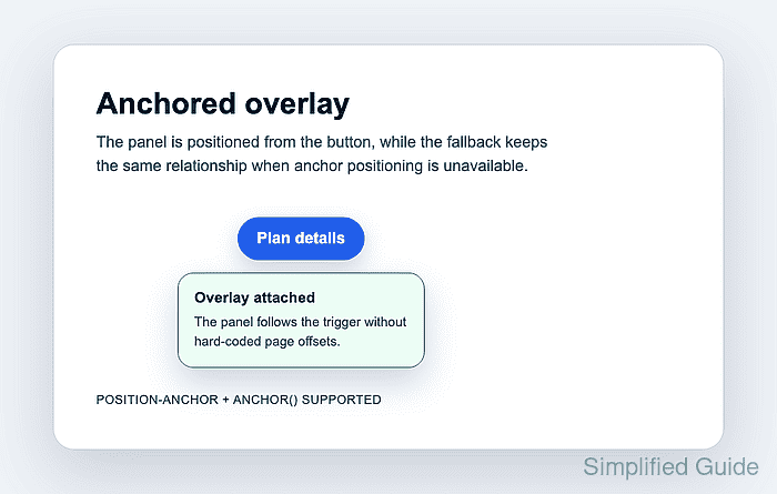
The trigger exposes an anchor name, and the absolutely positioned panel selects that anchor with position-anchor. The anchor() function can then read the trigger's edges or center line for properties such as top and left, which keeps the placement tied to the element rather than to a guessed coordinate on the page.
Keep a normal absolute-position fallback outside the feature query because anchor positioning is not available in every browser a site may support. Anchor positioning solves the visual placement; showing, hiding, focus handling, keyboard behavior, and dismissal still belong to the component logic or the Popover API when the overlay is interactive.
Related: How to add CSS feature-query fallbacks
Related: How to debug CSS z-index layering
Steps to position an overlay with CSS anchor positioning:
- Add the trigger and overlay to the component markup.
<div class="overlay-demo">
  <button class="info-trigger" type="button" aria-describedby="plan-panel">
    Plan details
  </button>

  <div class="info-panel" id="plan-panel" role="status">
    <strong>Overlay attached</strong>
    <span>The panel follows the trigger without hard-coded page offsets.</span>
  </div>
</div>
Keep the panel visible while testing the CSS, then connect visibility to the component's disclosure logic after placement is confirmed.
- Add the absolute-position fallback before the anchor-positioned enhancement.
.overlay-demo {
  position: relative;
  display: inline-block;
}

.info-panel {
  position: absolute;
  inset-block-start: calc(100% + 0.875rem);
  inset-inline-start: 50%;
  transform: translateX(-50%);
  z-index: 10;
  inline-size: 18rem;
  max-inline-size: min(22rem, calc(100vw - 2rem));
}
The fallback positions the panel from the wrapper because unsupported browsers ignore the anchor declarations inside the feature query.
- Add the anchor-positioned rule inside a feature query.
@supports (anchor-name: --plan-trigger) and (top: anchor(bottom)) {
  .info-trigger {
    anchor-name: --plan-trigger;
  }

  .info-panel {
    inset: auto;
    position-anchor: --plan-trigger;
    top: calc(anchor(bottom) + 0.875rem);
    left: anchor(center);
    transform: translateX(-50%);
  }
}
anchor(bottom) reads the trigger's lower edge, and anchor(center) reads its inline center. The inset: auto reset prevents the fallback inset values from competing with the anchor-positioned coordinates.
- Open the page in a target browser and confirm the anchor-positioning feature query passes.
CSS.supports('anchor-name: --plan-trigger') && CSS.supports('top: anchor(bottom)')
true
A false result means the browser keeps the fallback rule. Test the visible panel in that browser instead of assuming the enhanced placement is active.
- Check the overlay geometry in DevTools after the page renders.
(() => {
  const trigger = document.querySelector('.info-trigger').getBoundingClientRect();
  const panel = document.querySelector('.info-panel').getBoundingClientRect();
  return Math.round(panel.top - trigger.bottom);
})();
14
The returned value should match the gap in the CSS. Check the horizontal centers if the panel appears shifted by comparing trigger.left + trigger.width / 2 with panel.left + panel.width / 2.
- Resize the component and confirm the panel remains attached to the trigger.
If the panel clips at viewport edges, reduce the panel width, increase available component space, or add a collision-handling layer. Anchor positioning keeps the panel attached to the anchor; it does not automatically choose a new side for every viewport collision.
- Disable the @supports block temporarily and refresh the page to verify the fallback.
The panel should still appear below the trigger and centered from the wrapper. Restore the feature query after the fallback check.