How to align nested CSS grid layouts with subgrid
Nested page sections often break alignment when a component creates its own grid inside a larger layout. CSS subgrid lets that component reuse the parent grid's columns or rows, so panels, form controls, or card details line up with the same tracks instead of drifting into a separate layout.
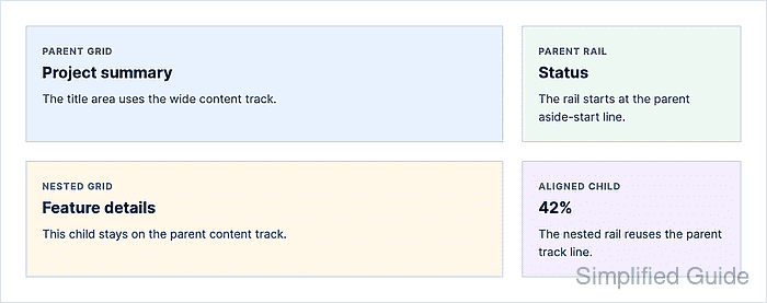
Apply subgrid on the nested grid item, not on the parent grid. The nested item must span the parent tracks it needs to reuse, and its own children can then be placed against the passed-through grid lines.
Keep a normal nested grid as the fallback and add subgrid inside a support query when browser policy still requires a fallback path. Responsive overrides should reset both parent placement and nested child placement when the parent grid collapses to one column.
Steps to align nested CSS grid layouts with subgrid:
- Add the parent layout and nested component markup.
<main class="layout">
  <section class="section-title">
    <h1>Project summary</h1>
    <p>The title area uses the wide content track.</p>
  </section>

  <aside class="rail">
    <h2>Status</h2>
    <p>The rail starts at the parent aside-start line.</p>
  </aside>

  <section class="feature" aria-label="Nested feature section">
    <article class="feature__copy">
      <h2>Feature details</h2>
      <p>This child stays on the parent content track.</p>
    </article>

    <aside class="feature__media">
      <h2>42%</h2>
      <p>The nested rail reuses the parent track line.</p>
    </aside>
  </section>
</main>
The nested feature element is both a grid item in the parent layout and a grid container for its own children.
- Define the parent grid with named column lines.
.layout {
  --layout-gap: 1.5rem;
  display: grid;
  grid-template-columns:
    [content-start] minmax(0, 1fr)
    [aside-start] minmax(14rem, 18rem)
    [content-end];
  gap: var(--layout-gap);
}

.section-title {
  grid-column: content-start / aside-start;
}

.rail {
  grid-column: aside-start / content-end;
}
Named lines make the alignment target explicit and avoid repeating fragile numeric line positions across nested components.
- Give the nested component a fallback grid.
.feature {
  grid-column: content-start / content-end;
  display: grid;
  grid-template-columns: minmax(0, 1fr) minmax(14rem, 18rem);
  gap: var(--layout-gap);
}

.feature__copy {
  grid-column: 1;
}

.feature__media {
  grid-column: 2;
}
This fallback keeps the component readable in a browser that does not support subgrid, but its duplicated track sizes must be kept in sync with the parent layout.
- Replace the nested column track list with subgrid when supported.
@supports (grid-template-columns: subgrid) {
  .feature {
    grid-template-columns: subgrid;
  }

  .feature__copy {
    grid-column: content-start / aside-start;
  }

  .feature__media {
    grid-column: aside-start / content-end;
  }
}
The nested grid reuses the parent column track sizes and column gap in the subgridded axis. A different column-gap on the nested grid overrides the passed-through gap.
- Reset both grids at the narrow breakpoint.
@media (max-width: 44rem) {
  .layout,
  .feature {
    grid-template-columns: 1fr;
  }

  .section-title,
  .rail,
  .feature,
  .feature__copy,
  .feature__media {
    grid-column: 1;
  }
}
Put this breakpoint after the subgrid support query so the single-column placement wins on small screens.
- Verify the browser is using subgrid on the nested component.
> CSS.supports("grid-template-columns", "subgrid")
true
> getComputedStyle(document.querySelector(".feature")).gridTemplateColumns
subgrid [] [] []
The computed value should include subgrid. If support is false, the fallback track list remains active.
- Check the mobile viewport for horizontal overflow.
> document.documentElement.scrollWidth <= window.innerWidth
true
The tested layout stacked both nested children at a 390 px viewport and kept the document width equal to the viewport width.