How to set fluid font sizes with CSS clamp()
Fluid typography lets headings and short display text scale gradually as the viewport changes instead of jumping only at breakpoint boundaries. CSS clamp() gives font-size a lower bound, a preferred fluid value, and an upper bound, so text can grow across wider layouts without becoming too small or too large.
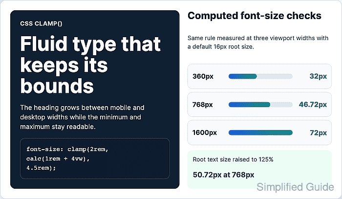
The preferred value should combine a rem term with a viewport unit. The rem part follows root text-size changes, while the vw part responds to viewport width. A value made only from viewport units can look fluid, but it gives readers less control when they enlarge text.
Use fluid type on specific text tokens or components rather than applying one formula across an entire site. Start with conservative limits, test the computed size at narrow, middle, and wide widths, and check a zoom or text-size increase before reusing the rule in a design system.
Related: How to set responsive CSS breakpoints
Related: How to load a web font with CSS
Steps to set fluid font sizes with CSS clamp():
- Choose a minimum size, a maximum size, and a viewport range for the text.
For a page heading, 2rem keeps the narrow layout readable, and 4.5rem keeps the wide layout from overwhelming nearby content.
- Add the fluid font-size rule to the target text.
.fluid-title {
  font-size: clamp(2rem, calc(1rem + 4vw), 4.5rem);
  line-height: 1.05;
  max-inline-size: 12ch;
}
clamp() reads as minimum, preferred, maximum. The preferred value scales between the limits until it reaches either 2rem or 4.5rem.
- Use a smaller fluid range for paragraph text when body copy also needs to scale.
.article-lede {
  font-size: clamp(1rem, calc(0.94rem + 0.3vw), 1.25rem);
  line-height: 1.55;
  max-inline-size: 65ch;
}
Keep paragraph growth modest because oversized body text and long line lengths make dense pages harder to scan.
- Check the computed heading size at a narrow viewport in the browser DevTools Console.
getComputedStyle(document.querySelector(".fluid-title")).fontSize; "32px" - Resize to a middle viewport and confirm the value sits between the bounds.
getComputedStyle(document.querySelector(".fluid-title")).fontSize; "46.72px" - Resize to a wide viewport and confirm the value stops at the maximum.
getComputedStyle(document.querySelector(".fluid-title")).fontSize;
"72px"
The sample values assume the browser default 16px root text size. Different root settings change the pixel output, but the value should still stay inside the rem bounds.
- Temporarily increase the root text size for an accessibility check.
document.documentElement.style.fontSize = "125%";
This simulates a larger root text setting in DevTools. Also test the page with the browser zoom control before shipping a typography token.
- Confirm the computed heading size increases with the root text size.
getComputedStyle(document.querySelector(".fluid-title")).fontSize;
"50.72px"
If the value barely changes during text-size or zoom testing, replace pure vw math with a preferred value that includes rem, such as calc(1rem + 4vw).
- Remove the temporary root text-size override.
document.documentElement.style.fontSize = "";