How to center an element with CSS flexbox
Flexbox centering is useful when one child needs to sit in the middle of a known container, such as an empty state, dialog body, loading panel, or hero block. The container becomes the flex formatting context, and the child is aligned inside the available space instead of being positioned with guessed margins or transforms.
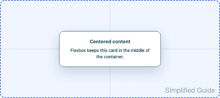
The centering depends on the container having space to distribute. Horizontal centering is visible as soon as the container is wider than the child, while vertical centering needs a height, min-height, or block size larger than the child. Without that available height, the element may already fill the container and the vertical alignment appears to do nothing.
With the default row direction, justify-content: center centers along the horizontal main axis and align-items: center centers along the vertical cross axis. If flex-direction changes to column, those axes swap, so keep the direction explicit when debugging an existing component.
Related: How to style an HTML button with CSS
Tool: CSS Flexbox Generator
Steps to center an element with CSS flexbox:
- Wrap the target element in a centering container.
<section class="center-stage">
  <div class="center-card">
    Centered content
  </div>
</section>
If several direct children are present, Flexbox centers the group as one flex line. Wrap the single item that should be centered when only one child should define the centered box.
- Give the container space for vertical centering.
.center-stage {
  min-height: 60vh;
  padding: 2rem;
  box-sizing: border-box;
}
min-height can be replaced with a fixed component height, viewport-based height, or parent-controlled block size. Vertical centering is visible only when the container is taller than the centered child.
- Turn the container into a flex container and center the child on both axes.
.center-stage {
  min-height: 60vh;
  padding: 2rem;
  box-sizing: border-box;
  display: flex;
  align-items: center;
  justify-content: center;
}
In the default row direction, justify-content controls horizontal placement and align-items controls vertical placement.
- Limit the child width so the centered element fits on narrow screens.
.center-card {
  width: min(100%, 24rem);
}
Fixed child widths, large margins, and transforms can make a centered item overflow or appear offset even when the container alignment is correct.
- Check the computed container alignment in the browser DevTools Console.
const styles = getComputedStyle(document.querySelector(".center-stage")); `${styles.display}; ${styles.justifyContent}; ${styles.alignItems}`; "flex; center; center" - Compare the container and child centers at a desktop viewport.
const stage = document.querySelector(".center-stage").getBoundingClientRect();
const card = document.querySelector(".center-card").getBoundingClientRect();

`x: ${Math.round((stage.left + stage.width / 2) - (card.left + card.width / 2))}; y: ${Math.round((stage.top + stage.height / 2) - (card.top + card.height / 2))}`;
"x: 0; y: 0"
The two zeros mean the child center matches the container center horizontally and vertically.
- Resize to a narrow viewport and repeat the center comparison.
const stage = document.querySelector(".center-stage").getBoundingClientRect();
const card = document.querySelector(".center-card").getBoundingClientRect();

`x: ${Math.round((stage.left + stage.width / 2) - (card.left + card.width / 2))}; y: ${Math.round((stage.top + stage.height / 2) - (card.top + card.height / 2))}`;
"x: 0; y: 0"
A value more than one pixel from zero usually points to fixed child width, margins, transforms, or a parent rule overriding display, justify-content, align-items, or min-height.