Device emulation in Playwright runs the same browser test with a phone or tablet profile instead of the default desktop context. It helps catch responsive layout, mobile user-agent, and touch-input regressions before a change reaches physical-device testing.
Playwright applies device descriptors through project configuration. A descriptor from devices sets values such as viewport, screen size, user agent, device scale factor, mobile mode, and touch support, and the project name becomes the value passed to --project.
A Pixel 5 descriptor under mobile-chrome exercises mobile Chromium in local and CI runs that have the Chromium browser installed. Real devices still matter for hardware, performance, and platform-specific browser behavior, but a named mobile project gives repeatable coverage for ordinary UI tests.
Steps to emulate devices in Playwright:
- Open playwright.config.ts in the Playwright project root.
JavaScript projects can use playwright.config.js with the same projects structure.
- Add a mobile project that uses a Playwright device descriptor.
- playwright.config.ts
import { defineConfig, devices } from '@playwright/test';

export default defineConfig({
  testDir: './tests',
  reporter: 'list',
  projects: [
    {
      name: 'mobile-chrome',
      use: {
        ...devices['Pixel 5'],
      },
    },
  ],
});
Merge the project object into an existing configuration instead of replacing unrelated webServer, use, timeout, reporter, or existing project settings. Options placed after the descriptor spread override values from the descriptor.
- Create a smoke test that checks the emulated mobile context.
- tests/device.spec.ts
import { test, expect } from '@playwright/test';

test('emulated device exposes mobile viewport and touch', async ({ page }) => {
  await page.setContent(`<!doctype html>
    <meta name="viewport" content="width=device-width, initial-scale=1">
    <button>Tap target</button>`);

  const device = await page.evaluate(() => ({
    width: window.innerWidth,
    maxTouchPoints: navigator.maxTouchPoints,
    coarsePointer: matchMedia('(pointer: coarse)').matches,
    userAgent: navigator.userAgent,
  }));

  expect(device.width).toBeLessThan(500);
  expect(device.maxTouchPoints).toBeGreaterThan(0);
  expect(device.coarsePointer).toBe(true);
  expect(device.userAgent).toContain('Mobile');
});
The meta viewport tag lets the page render at the emulated device width instead of a desktop layout width.
- List tests to confirm the mobile project is registered.
$ npx playwright test --list
Listing tests:
  [mobile-chrome] › device.spec.ts:3:5 › emulated device exposes mobile viewport and touch
Total: 1 test in 1 file
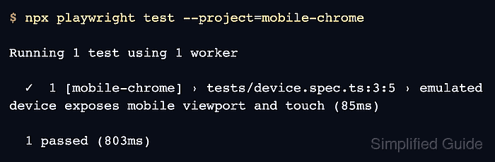
- Run the test with the mobile device project.
$ npx playwright test --project=mobile-chrome

Running 1 test using 1 worker

  ✓  1 [mobile-chrome] › tests/device.spec.ts:3:5 › emulated device exposes mobile viewport and touch (85ms)

  1 passed (803ms)

Mohd Shakir Zakaria is a cloud architect with deep roots in software development and open-source advocacy. Certified in AWS, Red Hat, VMware, ITIL, and Linux, he specializes in designing and managing robust cloud and on-premises infrastructures.


