How to replace left and right spacing with CSS logical properties
Left and right spacing in CSS ties a component to one horizontal reading direction. Replacing physical side declarations with logical inline properties lets margins, padding, borders, and positioned offsets follow the content direction without duplicating the component rule for right-to-left layouts.
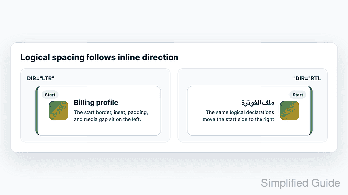
Logical inline properties describe the start and end of the inline axis. In horizontal left-to-right text, margin-inline-start maps to the left side and margin-inline-end maps to the right side; in right-to-left text, that mapping reverses. The same start and end mapping applies to padding-inline-*, border-inline-*, and inset-inline-* for positioned elements.
Replace only the declarations whose meaning is directional. Symmetric spacing such as gap, fixed corner rounding, or decoration that must always stay on one physical side can remain physical, while spacing that should follow text direction needs both left-to-right and right-to-left checks before the old declaration is removed.
Steps to replace physical CSS spacing with logical properties:
- Find the physical side declarations that describe inline start or inline end spacing.
- styles.css
.profile-card {
  position: relative;
  margin-left: 24px;
  margin-right: 8px;
  padding-left: 32px;
  padding-right: 16px;
  border-left: 6px solid #0f766e;
}

.profile-card__badge {
  position: absolute;
  top: 12px;
  left: 12px;
}

.profile-card__media {
  margin-right: 16px;
}
In horizontal writing, left and right are inline-axis sides. Top and bottom are block-axis sides, so replace them with block-start and block-end only when they should follow the writing mode.
- Replace outer margin and inner padding with logical inline properties.
- styles.css
.profile-card {
  margin-inline-start: 24px;
  margin-inline-end: 8px;
  padding-inline-start: 32px;
  padding-inline-end: 16px;
}
When an older browser support target still needs physical fallbacks, keep the physical declarations before the logical declarations or gate the logical branch with a feature query.
Related: How to add CSS feature-query fallbacks - Replace the directional border and positioned start offset.
- styles.css
.profile-card {
  position: relative;
  border: 1px solid #cbd5e1;
  border-inline-start: 6px solid #0f766e;
}

.profile-card__badge {
  position: absolute;
  inset-block-start: 12px;
  inset-inline-start: 12px;
}
inset-inline-start replaces left for a badge that should sit at the start edge. inset-block-start replaces top when the badge should stay at the block-start edge in other writing modes.
- Replace child spacing that depends on which side follows the content.
- styles.css
.profile-card__media {
  margin-inline-end: 16px;
}
Use gap instead when every adjacent flex or grid item should receive the same spacing in both directions.
- Add a left-to-right and right-to-left fixture around the same component.
- index.html
<main class="fixture">
  <section class="demo-ltr" dir="ltr">
    <article class="profile-card">
      <span class="profile-card__badge">Start</span>
      <span class="profile-card__media" aria-hidden="true"></span>
      <h2>Billing profile</h2>
    </article>
  </section>

  <section class="demo-rtl" dir="rtl">
    <article class="profile-card">
      <span class="profile-card__badge">Start</span>
      <span class="profile-card__media" aria-hidden="true"></span>
      <h2>ملف الفوترة</h2>
    </article>
  </section>
</main>
The two sections should use the same class names and stylesheet. Only the dir attribute changes between the fixtures.
- Verify the left-to-right computed sides in the browser console.
> getComputedStyle(document.querySelector(".demo-ltr .profile-card")).marginLeft
"24px"
> getComputedStyle(document.querySelector(".demo-ltr .profile-card")).paddingLeft
"32px"
> getComputedStyle(document.querySelector(".demo-ltr .profile-card")).borderLeftWidth
"6px"
> getComputedStyle(document.querySelector(".demo-ltr .profile-card__badge")).left
"12px"
> getComputedStyle(document.querySelector(".demo-ltr .profile-card__media")).marginRight
"16px"
- Verify the right-to-left computed sides after the same stylesheet renders under dir=“rtl”.
> getComputedStyle(document.querySelector(".demo-rtl .profile-card")).marginRight
"24px"
> getComputedStyle(document.querySelector(".demo-rtl .profile-card")).paddingRight
"32px"
> getComputedStyle(document.querySelector(".demo-rtl .profile-card")).borderRightWidth
"6px"
> getComputedStyle(document.querySelector(".demo-rtl .profile-card__badge")).right
"12px"
> getComputedStyle(document.querySelector(".demo-rtl .profile-card__media")).marginLeft
"16px"
- Check the fixture for horizontal overflow at the tested viewport.
> document.querySelector(".fixture").scrollWidth === document.querySelector(".fixture").clientWidth
true
If the comparison fixture becomes wider than its container after the replacement, inspect fixed inline sizes, long text, and flex or grid children before adding global clipping.
Related: How to fix CSS horizontal overflow