How to create CSS scroll snapping
Scroll snapping lets a scroll container settle on complete panels after wheel, touch, keyboard, or programmatic scrolling. It fits carousels, card rows, and section scrollers where stopping midway through an item makes the interface feel unfinished.
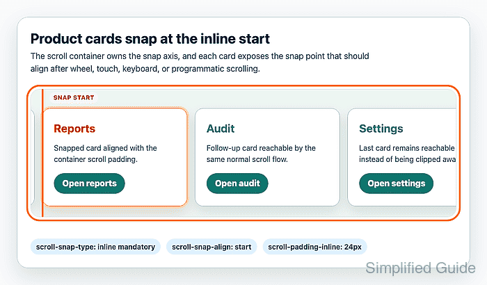
CSS scroll snap is split between the container and the snap targets. The container sets the axis and strictness with scroll-snap-type, while each card defines its alignment point with scroll-snap-align. scroll-padding reserves inset space so the snapped item can stop clear of a sticky edge or visual gutter.
Use strict mandatory snapping only when every target remains reachable at small viewports and with keyboard focus. The card row in this pattern keeps normal overflow scrolling, leaves document order unchanged, and checks both the snapped alignment and page overflow before use.
Related: How to fix CSS horizontal overflow
Related: How to style keyboard focus with CSS
Related: How to respect reduced motion with CSS
Steps to create CSS scroll snapping:
- Add semantic markup for the scroll region and snap targets.
<section class="snap-gallery" aria-labelledby="featured-products-title">
  <h2 id="featured-products-title">Featured products</h2>

  <div class="snap-gallery__scroller" tabindex="0" aria-label="Featured products">
    <article class="snap-card">
      <h3>Suite</h3>
      <p>Overview card with product status and short summary text.</p>
      <a href="/products/suite">Open suite</a>
    </article>

    <article class="snap-card">
      <h3>Reports</h3>
      <p>Monthly reporting card with the next primary action.</p>
      <a href="/products/reports">Open reports</a>
    </article>

    <article class="snap-card">
      <h3>Audit</h3>
      <p>Compliance card reachable through the same normal scroll flow.</p>
      <a href="/products/audit">Open audit</a>
    </article>
  </div>
</section>
tabindex=“0” lets keyboard users focus the scroll container before using arrow keys, Page Up/Page Down, or trackpad scrolling.
- Add the scroll snap styles to the site stylesheet.
- styles.css
.snap-gallery__scroller {
  display: flex;
  gap: 1rem;
  overflow-x: auto;
  overscroll-behavior-inline: contain;
  scroll-padding-inline: 1rem;
  scroll-snap-type: inline mandatory;
  padding: 0.25rem 1rem 1rem;
}

.snap-card {
  flex: 0 0 clamp(16rem, 78vw, 22rem);
  scroll-snap-align: start;
}

.snap-card:focus-within {
  outline: 3px solid #f97316;
  outline-offset: 4px;
}
inline follows the writing mode. Use scroll-snap-type: x mandatory; only when the component must always snap on the physical horizontal axis.
- Confirm that the browser supports the chosen snap axis.
> CSS.supports('scroll-snap-type: inline mandatory')
true
Use a feature query or a non-snapping overflow layout as the fallback when this check returns false.
Related: How to add CSS feature-query fallbacks - Confirm that the scroll container received the snap type.
> getComputedStyle(document.querySelector('.snap-gallery__scroller')).scrollSnapType
'inline mandatory'
- Confirm that the cards expose a snap alignment point.
> getComputedStyle(document.querySelector('.snap-card')).scrollSnapAlign
'start'
- Scroll the card row until a middle card is closest to the start edge, then release.
The card should settle against the inset created by scroll-padding-inline. If a sticky header, side rail, or visible gutter covers the card edge, increase the scroll padding rather than adding empty spacer elements.
- Tab through the card links and confirm each focused link scrolls into view.
Keep the DOM order and visual order the same for scroll-snapped cards. Reordering cards visually can make keyboard focus appear to jump through the carousel.
- Check that the page itself did not gain horizontal overflow.
> document.documentElement.scrollWidth === document.documentElement.clientWidth
true
If this returns false, inspect fixed card widths, unbreakable text, and media inside each card before hiding overflow on the page.
Related: How to fix CSS horizontal overflow