How to style parent elements with the CSS :has selector
Components often need a parent state after their content changes, such as a card that contains a warning badge or a field with a checked control. CSS :has() lets the selector look inside or across from the element being styled, so the parent can change without adding a wrapper class from JavaScript.
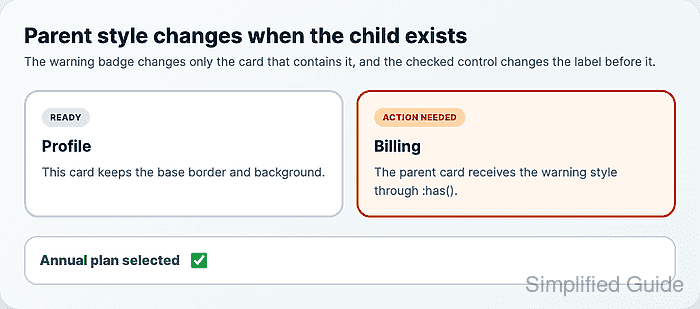
Use :has() from the element that receives the style. A selector such as .notice-card:has(.notice-card__badge--warning) styles the card when the badge exists, while label:has(+ input:checked) styles a label when the adjacent checkbox after it is checked.
Keep the selector scoped to the component and leave a normal base style outside the support query. Broad selectors such as body:has(...) can make the browser reconsider large parts of the page, and the specificity of :has() includes the most specific selector inside its argument.
Related: How to add CSS feature-query fallbacks
Related: How to debug CSS specificity
Steps to style parent elements with CSS :has():
- Add markup with the child state and adjacent control state.
- index.html
<section class="notice-grid" aria-label="Cards">
  <article id="billing-normal" class="notice-card">
    <span class="notice-card__badge">Ready</span>
    <h2>Profile</h2>
    <p>This card keeps the base border and background.</p>
  </article>

  <article id="billing-alert" class="notice-card">
    <span class="notice-card__badge notice-card__badge--warning">Action needed</span>
    <h2>Billing</h2>
    <p>The parent card receives the warning style through :has().</p>
  </article>
</section>

<div class="field">
  <label class="field-label" for="annual-plan">Annual plan selected</label>
  <input id="annual-plan" class="field-control" type="checkbox" checked>
</div>
The second selector works because the label is immediately before the checkbox. If the input is wrapped inside the label instead, use a parent selector such as .field-label:has(input:checked).
- Add the base styles that should work without :has() support.
- styles.css
.notice-grid {
  display: grid;
  grid-template-columns: repeat(2, minmax(0, 1fr));
  gap: 1rem;
}

.notice-card {
  padding: 1rem;
  border: 3px solid #cbd5e1;
  border-radius: 1rem;
  background: #ffffff;
  color: #334155;
}

.notice-card__badge--warning {
  background: #fed7aa;
  color: #9a3412;
}

.field-label {
  color: #334155;
  font-weight: 600;
}
The fallback leaves the warning badge visible even when the parent-card enhancement is not applied.
- Add the :has() rules inside a selector support query.
- styles.css
@supports selector(.notice-card:has(.notice-card__badge--warning)) {
  .notice-card:has(:where(.notice-card__badge--warning)) {
    border-color: #c2410c;
    background: #fff7ed;
  }

  .field-label:has(+ .field-control:checked) {
    color: #166534;
    font-weight: 800;
  }
}
:where() keeps the warning badge selector from adding specificity inside :has(). Remove it when the child selector intentionally needs to make the rule harder to override.
Related: How to debug CSS specificity - Keep the subject selector close to the element that changes.
- styles.css
/* Avoid using the document root as the subject for component state. */
body:has(.notice-card__badge--warning) .notice-card {
  border-color: #c2410c;
}

/* Scope the match to the component that receives the style. */
.notice-card:has(:where(.notice-card__badge--warning)) {
  border-color: #c2410c;
}
The element before :has() is the subject that receives the style. A narrower subject gives the browser less page state to reconsider when descendants change.
- Check whether the browser supports the :has() selector branch.
> CSS.supports("selector(.notice-card:has(.notice-card__badge--warning))")
true
Use the same selector shape that the stylesheet depends on when testing support.
Related: How to add CSS feature-query fallbacks - Verify that only the card containing the warning badge receives the parent style.
> getComputedStyle(document.querySelector("#billing-alert")).borderColor
"rgb(194, 65, 12)"
> getComputedStyle(document.querySelector("#billing-normal")).borderColor
"rgb(203, 213, 225)"
- Verify that the label before the checked control receives the adjacent-sibling style.
> getComputedStyle(document.querySelector('[for="annual-plan"]')).color
"rgb(22, 101, 52)"
- Clear the checkbox state.
> document.querySelector("#annual-plan").checked = false
false
- Verify that the label returns to the base style after the control is unchecked.
> getComputedStyle(document.querySelector('[for="annual-plan"]')).color
"rgb(51, 65, 85)"