How to add CSS feature-query fallbacks
New CSS features can improve a component while older browsers still need a readable base style. A feature query with @supports lets the stylesheet apply an enhancement only when the browser understands the tested declaration.
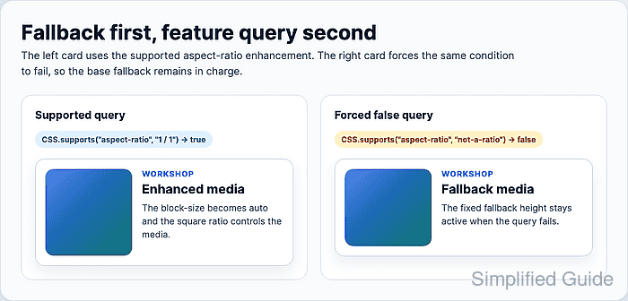
The fallback-first pattern keeps the normal rule outside the feature query, then places the newer declaration in a later @supports block. That order matters because unsupported browsers ignore the whole block, while supported browsers read the later rule and let it override the fallback through normal source order.
Feature queries test syntax support, not every rendering bug or design requirement. Check the exact property-value pair with CSS.supports(), verify the computed style after the page renders, and force the query to fail in a local test copy before relying on the fallback path.
Steps to add CSS feature-query fallbacks:
- Choose the feature and the fallback behavior.
Use the exact syntax the enhancement depends on, such as (aspect-ratio: 1 / 1) or selector(.card:has(.badge)). A broad property check can pass even when the specific value or selector form you need is not accepted.
- Add markup that works with the fallback style.
- index.html
<article class="feature-card">
  <div class="feature-card__media" aria-hidden="true"></div>

  <div class="feature-card__body">
    <p class="feature-card__eyebrow">Workshop</p>
    <h2>Layout fallback</h2>
    <p>
      The media block has a fixed fallback height before the
      aspect-ratio enhancement is applied.
    </p>
  </div>
</article>
- Write the fallback CSS before any feature query.
- styles.css
.feature-card {
  display: flex;
  align-items: flex-start;
  gap: 1rem;
  max-inline-size: 36rem;
  padding: 1rem;
  border: 1px solid #cbd5e1;
  border-radius: 1rem;
  background: #ffffff;
  color: #1e293b;
}

.feature-card__media {
  flex: 0 0 clamp(7rem, 28vw, 9rem);
  inline-size: clamp(7rem, 28vw, 9rem);
  block-size: 8rem;
  border-radius: 0.875rem;
  background: linear-gradient(135deg, #2563eb, #0f766e);
}

.feature-card__body {
  min-inline-size: 0;
}
The fallback fixes the media block height so the card still has a predictable shape when aspect-ratio is not supported.
- Add the enhancement in a later @supports block.
- styles.css
@supports (aspect-ratio: 1 / 1) {
  .feature-card__media {
    block-size: auto;
    aspect-ratio: 1 / 1;
  }
}
Keep the enhancement after the fallback. Supported browsers read both rules, and the later declaration changes block-size from the fixed fallback to auto.
- Check whether the browser accepts the feature-query condition.
CSS.supports("aspect-ratio", "1 / 1")
true
A false result means the browser keeps the fallback CSS because the @supports block is ignored.
- Verify the enhanced media block in the browser console.
const media = document.querySelector(".feature-card__media");
const style = getComputedStyle(media);

style.aspectRatio
"1 / 1"
style.blockSize
"144px"
- Force the feature query to fail in a local test copy.
- styles.css
@supports (aspect-ratio: not-a-ratio) {
  .feature-card__media {
    block-size: auto;
    aspect-ratio: 1 / 1;
  }
}
Use an impossible value only while testing the fallback path. Do not commit the forced-false condition.
- Verify the fallback media block after the forced-false test reloads.
CSS.supports("aspect-ratio", "not-a-ratio")
false
getComputedStyle(document.querySelector(".feature-card__media")).aspectRatio
"auto"
getComputedStyle(document.querySelector(".feature-card__media")).blockSize
"128px"
- Restore the real support condition before saving the stylesheet.
- styles.css
@supports (aspect-ratio: 1 / 1) {
  .feature-card__media {
    block-size: auto;
    aspect-ratio: 1 / 1;
  }
}